The interior of the Princessehof in the 1950’s.
Image courtesy of: OKS (Ottema-Kingma Stichting)
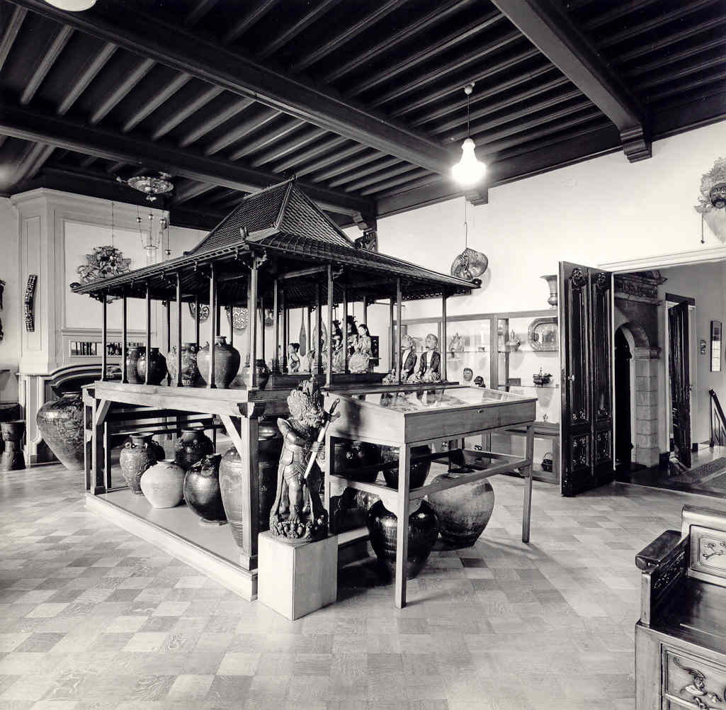
The interior of the Princessehof in the 1950’s.
Image courtesy of: OKS (Ottema-Kingma Stichting)
The Princessehof National Museum of Ceramics was inaugurated in 1917 by Nanne Ottema. The Dutch notary was in love with The Netherlands’ history with ceramics and collection ceramics had become his passion. This love affair was facilitated by Ottema’s proximity to the Friesland region where he grew up. This region specifically has always had a longstanding tradition of ceramics production.
Throughout the years, Ottema amassed an enormous collection of ceramics; including many pieces of Asian and Islamic porcelain. By his own estimates, Ottema collected close to 30,000 items and he also built up an extremely (over 20,000 titles) inclusive library of high quality books. This treasure is called the Princessehof Library and is fully functional to this day.
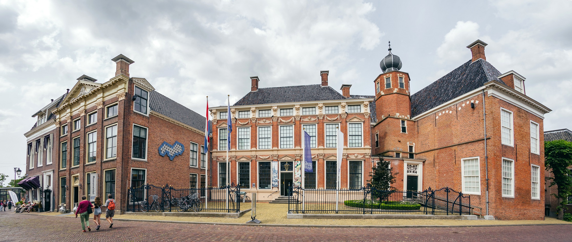
Since the building’s exterior has been awarded a heritage prize and couldn’t be altered, only the 13,000-square-foot interior could be renovated!
Image courtesy of: Asia-Europe Museum Network
Until recently, the collection remained in relative disarray. Quite common in The Netherlands, the museum is housed in a collection of adjoining buildings, formerly significant private residences. For example, one structure is a red-brick building from 1622 which served as the royal residence for Maria Louis, the Princess of Orange.
There was a renovation in 1970 which increased the museum’s footprint but did nothing for its clustered feeling. Also a hinderance was that the museum was full of stairs and ladders. Luckily, and just in time for the museum’s 100th anniversary, i29 Interior Architects devised a solution for the interior.
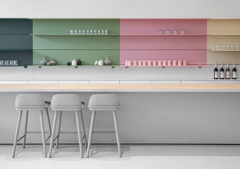
The level differences and horizontal displays reference earth’s many layers. This is a subtle nod to ceramic’s natural resource.
Image courtesy of: DesignBoom
The three stories of the interior were essentially gutted. The entrance was opened up from the beautiful garden and rooms were masterfully restored and reopened. Now for the first time, you can walk around the whole perimeter on the inside. Most importantly, installation are clearly denoted and highlighted effectively.
There’s a distinct starting point: a gallery that displays mass-produced ceramics from around the world. This display is shown in white display cases inspired by shipping crates. Lit from within, items are stacked high yet the collection is shown in a clean, minimalistic way.
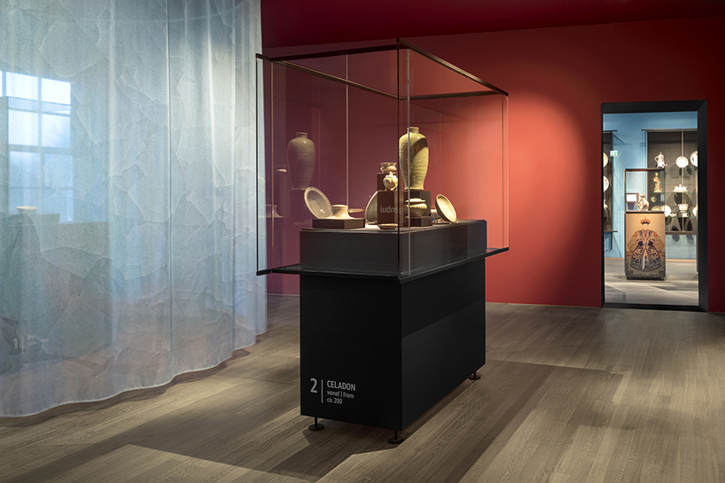
Chinese Imperial Porcelain from 2800 BC is highlighted in a dramatic way.
Image courtesy of: Dutch Design
We love the idea of differentiating the gallery spaces according to color. As an example, the walls are painted a bright red for the ancient Chinese gallery of the porcelain collection.
The custom shelving is power-coated steel and displays stand 8-feet high on the gallery’s stained wood flooring which is original to the building.
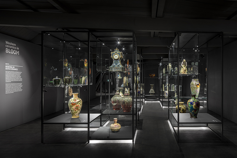
In this dark room, the “Ceramics in Bloom” exhibition is both dramatic and elegant. Set on dark shelves, the pieces appear as though they’re floating in space.
Image courtesy of: DesignBoom
In the 13,000-square-foot interior, the collection encompasses a very wide range of time. From Chinese Imperial porcelain to Art Nouveau, national treasures of Delft Blue objects, and ceramics by Picasso there somethings for everyone. In addition to the beautiful permanent exhibitions, the museum has many “temporary” installations.