Architecture
A museum and bridge in one…
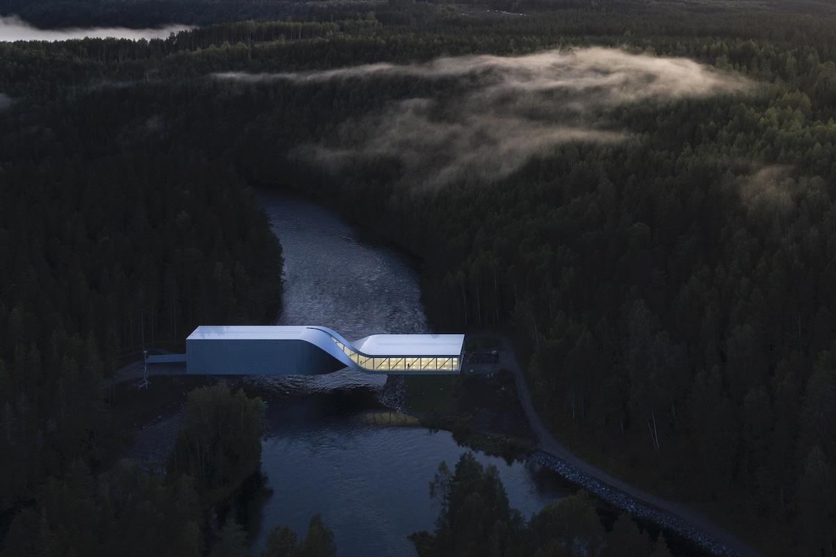
The bridge quietly opened in September 2019.
Image courtesy of: My Modern Met, photographed by: Laurian Ghinitoiu
You don’t usually put museums and bridges together… but now there is good reason to do it. An “off the cusp” bridge in Norway is an architectural feat; one which also houses a contemporary art museum.
“The Twist” was designed by Bjarke Ingels Group (BIG), a Danish architectural group, and it marks the first project the firm has done in Norway. BIG won a 2015 international competition to create the bridge. The 10,764-square-foot aluminum-clad bridge connects two river banks with its twisted form allowing it to move from a lower to a high elevation with relative ease. It is this uneven elevation that created a problem in the first place. Who knew it would translate to such a wonderful design.
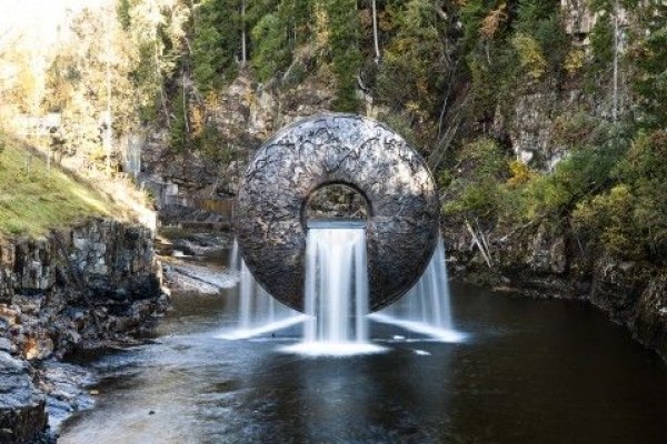
“All of Nature Flows Through Us”.
The sculpture by Marc Quinn is located in the middle of the Kistefossen River.
Image courtesy of: St. Olav Ways
“The Twist” spans the Randselva River at the Kisterfos Museum and Sculpture Park in Jevnaker, eighty kilometers northwest of Oslo. The history behind the museum and park is interesting. In 1996, Christen Sveaas, a businessman, built these two “attractions” on the site of his family’s former wood pulp mill business, one of the oldest in Scandinavia.
The sculpture park contains pieces by Anish Kapoor, Fernando Botero, Yayoi Kusama, and Olafur Eliasson. Now, they have a contemporary bridge to add to the varied attractions. The evolving complex also features exhibition galleries and an industrial museum.
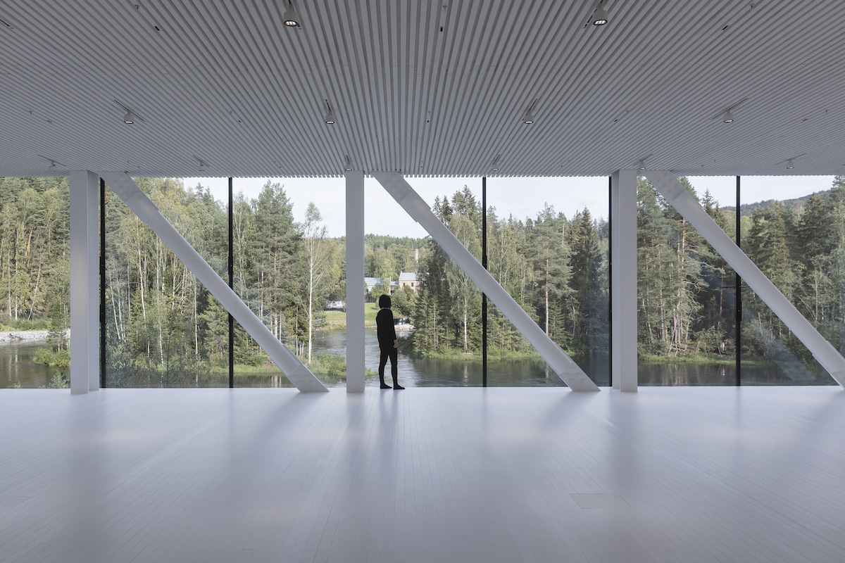
The windows allows visitors to experience the rural woodlands outside of Oslo.
Image courtesy of: My Modern Met, photographed by: Laurian Ghinitoiu
The delicate twisting form, surprisingly, is comprised of completely straight lines. Raw aluminum strips are placed in a staggered fashion to create an illusion of curves. Obviously, the exterior twist also impacts the interior. A specific form half-way through the journey provides for a seamless transition from the windowless space into the light-filled north side of the building.
The Twist design is vital in allowing for previously unattainable views of the river and mill, aided by the floor-to-ceiling windows.
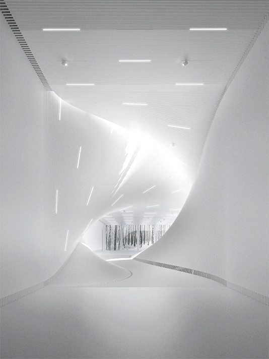
Of the space, Bjarke Ingels, founding partner and creative director of BIG said, “As a bridge it reconfigures the sculpture park turning the journey through the park into a continuous loop. As a museum it connects two distinct spaces- an introverted vertical gallery and an extroverted horizontal gallery with panorama views across the river. A third space is created through the blatant translation between these two galleries creating the namesake twist”.
Image courtesy of: Design Milk
In order to pay homage to the post-industrial site, BIG wrapped The Twist in strips of raw aluminum. The pieces are staggered, not unlike a deck of cards, in order to create the optical illusion of a curved form. The continuous and constant use of aluminum on the facade results in an organic appearance which helps unite the two ends of the building, which are quite different in character and size from one another.
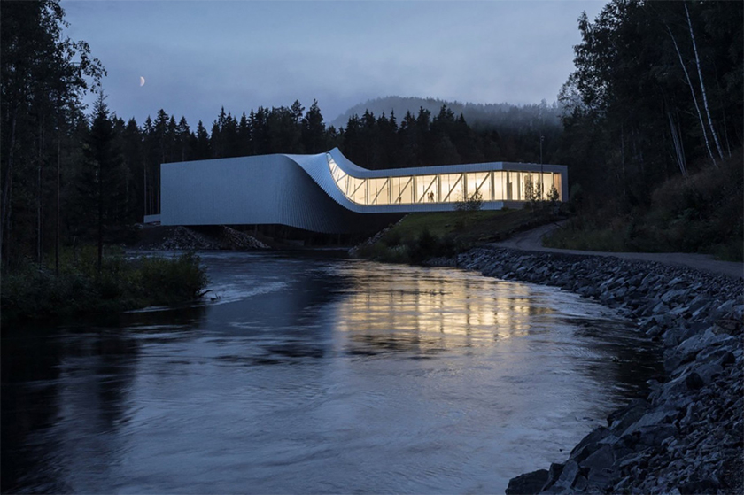
Beautiful at nighttime!
Image courtesy of: Design Milk
The twist forms a folding shell-like passageway between two galleries. The consistency of the interior, white-painted slats of Douglas Fir, creates a simple backdrop for the artwork. Whether you want to call it a museum, a bridge, or a park… you can’t deny that this is an amazing hybrid of architecture, infrastructure, and art.
