Design
Atelier Ellis… an eye-opening paint company
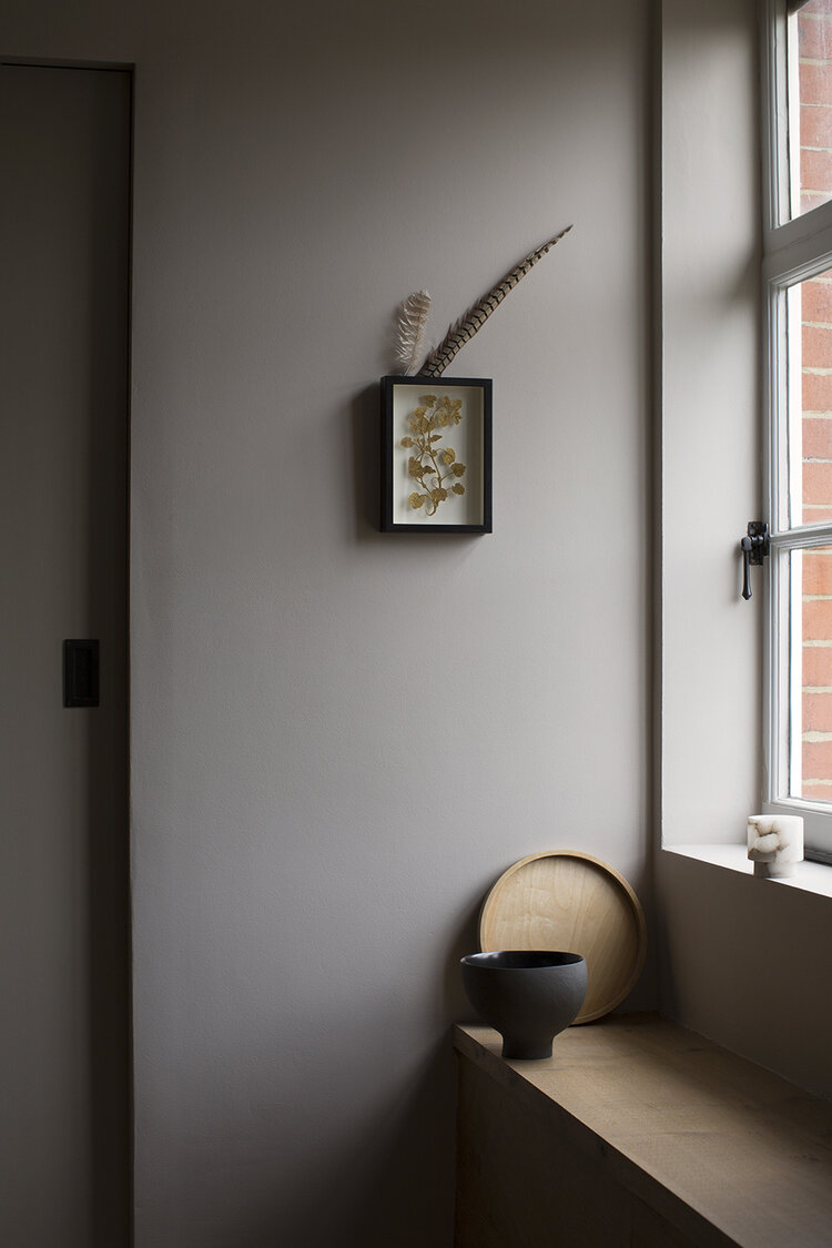
Paint color, Cotta.
Image courtesy of: Aucoot, photographed by: Kalina Krawczyk
Breaking into the established “paint industry” is quite difficult; for high-end paint, Farrow & Ball has led the way for many years, the established brand that was founded in 1946. However these days, Atelier Ellis has been determinedly making waves.
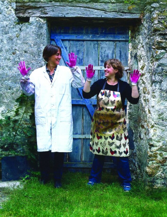
Founded in 2018 by the New Zealand-born, UK-based Cassandra Ellis, Atelier Ellis has been quietly and steadily gaining a reputation for serene, beautiful colors that are hand-mixed. As an independent maker, it means they can be completely open and transparent about their process.
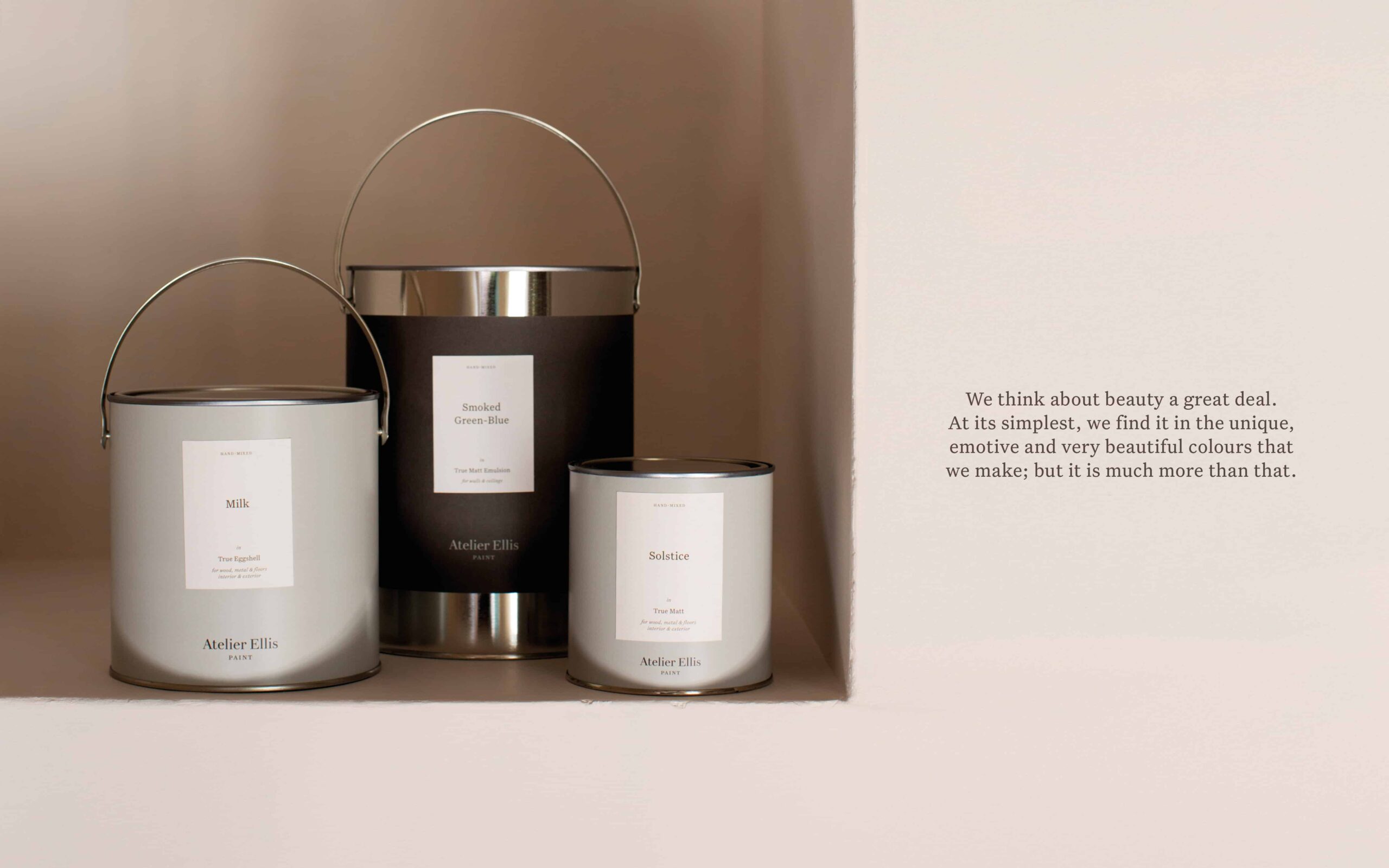
The redesigned paint tin cans are available in three sizes.
Image courtesy of: The Dieline
In order to ensure that the company is developed and operating in a sustainable fashion, Ellis decided to bring the paint mixing to an “in-house” setting. In addition to garnering more control over the intensive production process, this allowed Ellis to rebrand the product, change the packaging, and re-evaluate the established name.
With paint production now done in-house, there was an opportunity to reimagine the tins’ design. The new, “fully recyclable metal tins” required a design that would work for each of the three tin sizes, the three different paint finishes, and more than 50 different colors… and growing. All in all, the new tin design needed to account for over 450 paint combinations.
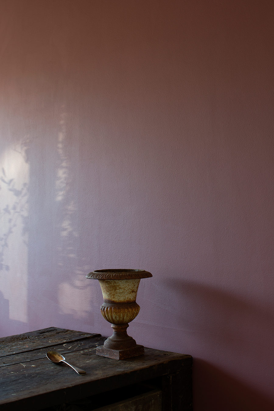
“Rubus,” the inspiration for this paint color, comes from berry picking, jam, and “ready to eat” raspberries.
Image courtesy of: Lobster and Swan
The pandemic was actually beneficial for Ellis’ business; the owner described (courtesy of an article in Aucoot) “The control over the physicality of our space has definitely become more important, because there’s a lot of things which are now completely out of our control.” In addition, the time for self-reflection gave many consumers the perspective to realize the importance of supporting small businesses vs. mass-marketed organizations.
All of the paints are conscientiously-named due to the emotion “behind the experience of that colour.” As an example, Atelier Ellis has one color called Mordandi Yellow, this was named after the color of Morandi’s well-known still-life painting.
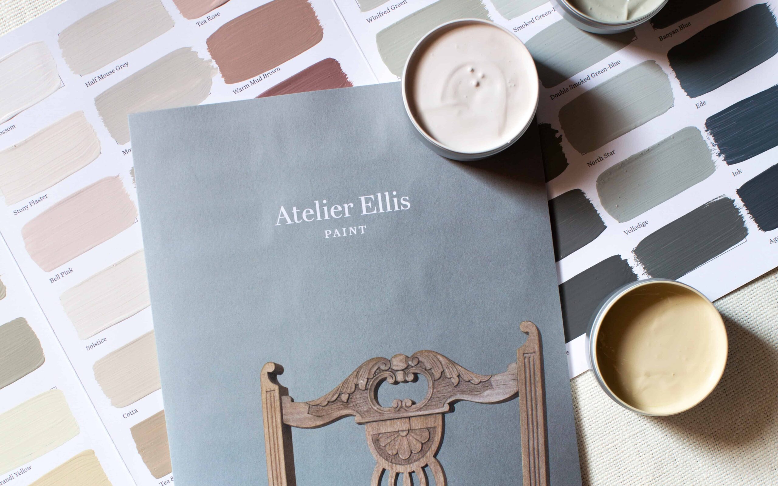
Color cards… each card is hand-painted with two coats of True Matte Emulsion. Last year, the company made a conscious decision to stop providing sample pots in order to do their part in minimizing waste and transportation. Finally, all printed matter is printed on recyclable, unbleached stock.
Image courtesy of: The Dieline
Today, there are 101 colors in Atelier Ellis’ collection. For most, the inspiration comes from (courtesy of the company’s web site) “the way we live in nature, in cities and society, the distinctive shades are designed to create quiet, joyful backdrops to people’s homes and lives, helping them tell their unique stories of home in the way they choose.”
Perhaps the biggest difference between the paint atelier and other luxury paint companies is that 94% of their materials are natural and unmodified. The remaining 6% comes from reputable suppliers who have a long and trusted track record. Virtually free from heavy metals, glycol, and microplastics, the paints are both OC and APE free.
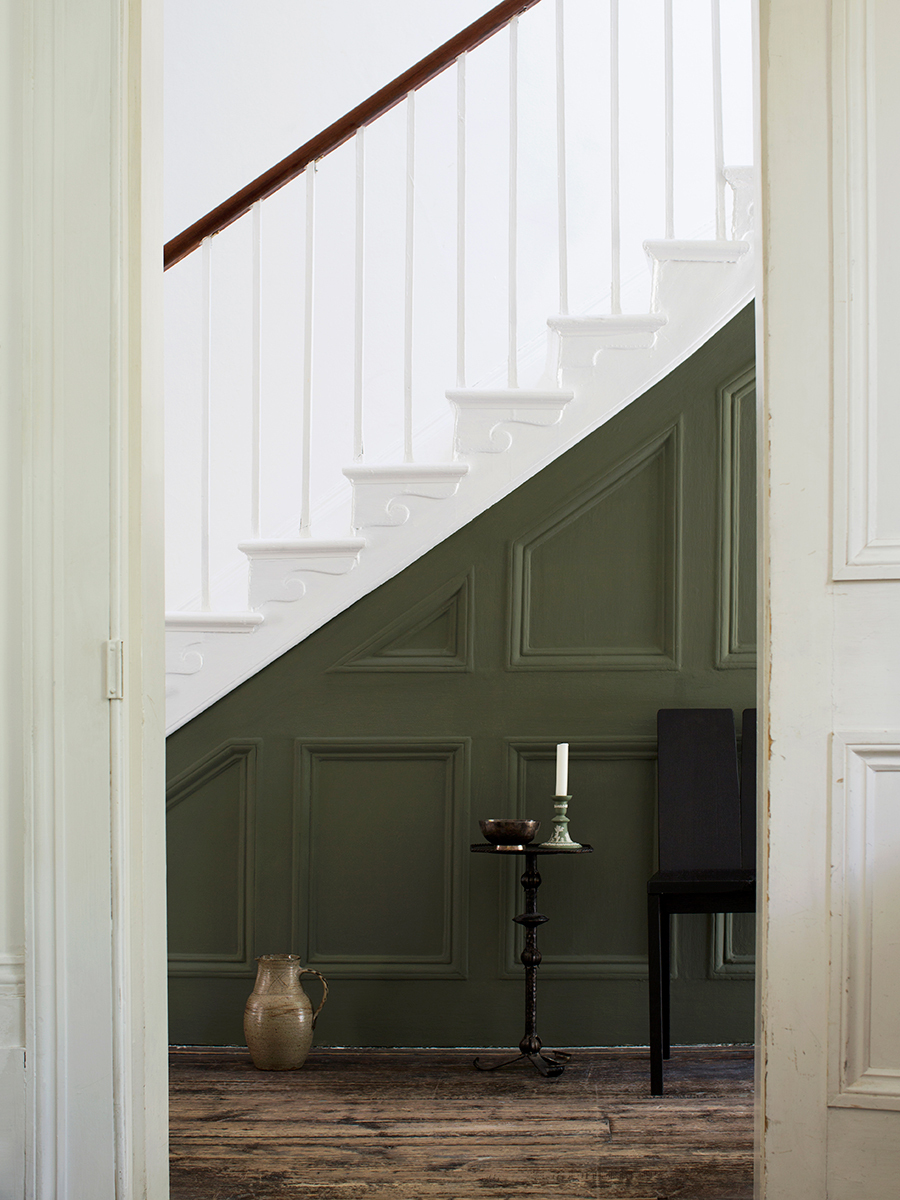
The green color, Totara, is a forest green named after a well-known New Zealand tree species.
Image courtesy of: World of Interiors, photographed by: Karina Krawczyk
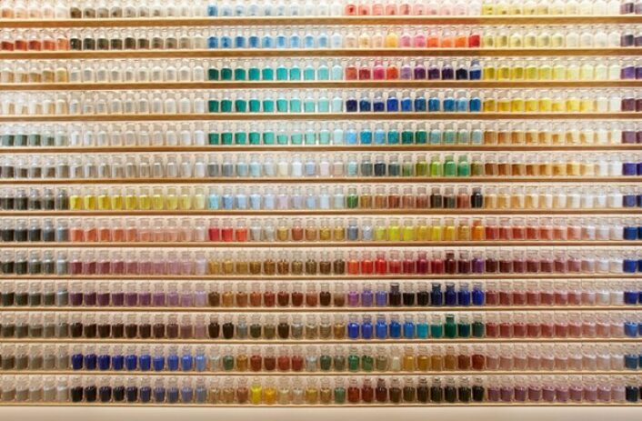
The four-story townhome that Ellis converted into a peaceful setting for her customers allows them to envision how the paint can work in their own homes. On an artisan-friendly street in Bath, Atelier Ellis is set up so that guests can see the company’s full palette of colors as they enter on the ground floor. In two adjoining spaces, artisans mix paints. The remaining rooms across the four floors are studios and workshops where Ellis is able to conduct one-on-one consultations.
A statement from Atelier Ellis’ website sums it all up perfectly, “Possibly the most important thing we do is to make beautiful colours. Colours that make people feel safe, joyous and uplifted in their homes. Colours that become memory markers of good times and bad, beautiful days and nights – and colours which stay, because the memory and the feeling they create means that people don’t want to change them.”
