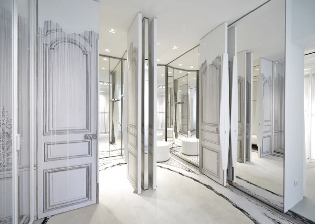
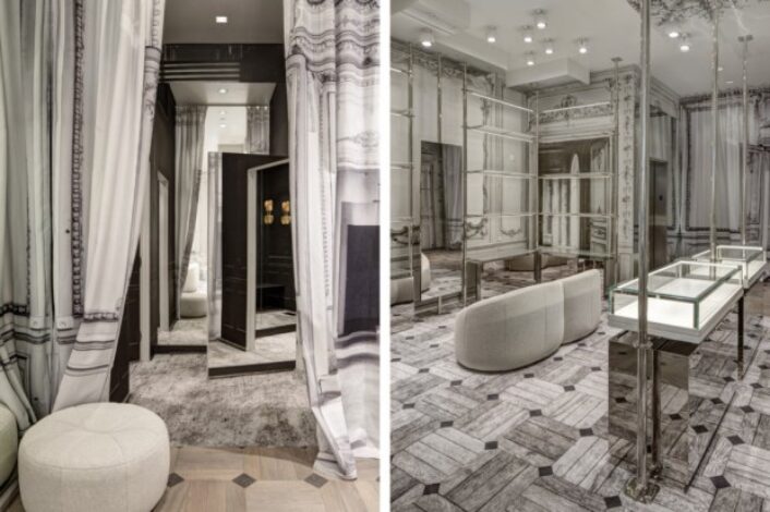
Paris-based fashion house, Maison Margiela, is notoriously tight-lipped. It’s a strategy that’s worked well for the 27-year-old brand. However, a new boutique such as this couldn’t stay a secret for long! With a color-scheme of solely black and white, the effect is the opposite of monotonous! White is the dominate color towards the front of the store and gradually, darker tones come into play. You almost feel as though you are searching for a hidden treasure…
Key design details include the carpet that appears as oak wood tiles. the stairway runner resembling a collage of Persian designs, and the stair handrail covered in perforated leather.
Serene, elegant and inviting… all the elements we find most necessary when stepping foot inside a high-end boutique!

With a vibe of “industry luxe” that they have long been known for, Maison Margiela accomplishes so very much with its new San Francisco boutique!
Image courtesy of: Hyperbeast

Trompe-l’oeil effects create the illusion of three-dimensional ceiling mouldings and wood panelling throughout the store. Dressing rooms are light and bright!
Image courtesy of: Dezeen

The leather-wrapped handrails with the beautifully carpeted stairs provide added style to the 2,900 square-foot space!
Image courtesy of: SF Gate
