Design
Eny Lee Parker
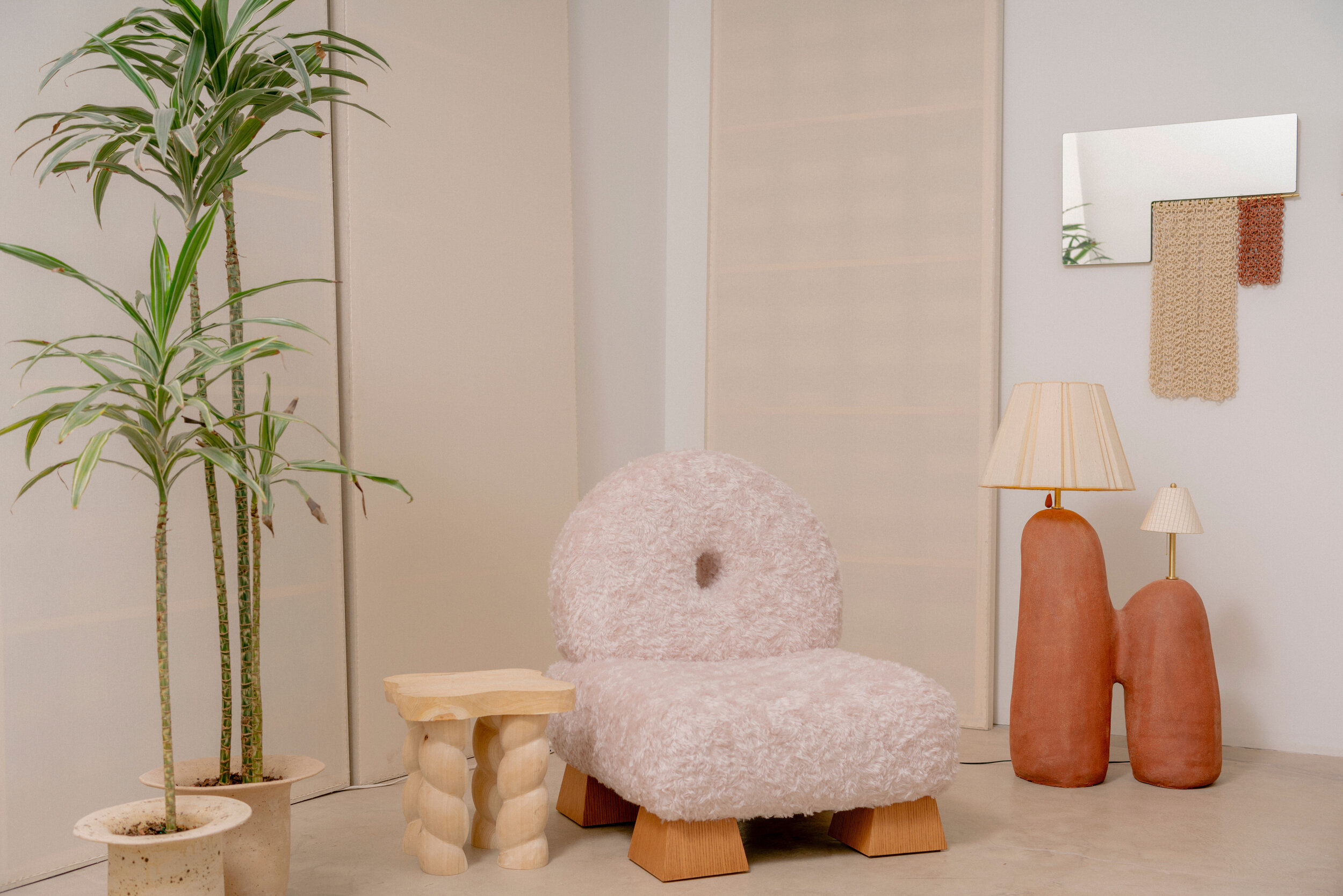
Asterisk Chair. Reminiscent of low-slung slipper chairs that were popular during the Victorian Era when “proper ladies” needed a comfortable place to sit on when putting on their stockings and shoes. This chair is upholstered in mohair; the rounded shape resembles an “O”. The chair can be accompanied by Parker’s Stitch Stool for an “XO” effect. Made from a wooden structure and upholstered in Raf Simons Mohair.
Dimensions are: 32″(w) x 38″(h) x 32″(d)
Image courtesy of: Eny Lee Parker
Eny Lee Parker is a Brazilian-born, Korean designer who works in Queens. With her eclectic background, there’s no doubt that the designer is full of amazing possibilities! The items that Parker designs are both whimsical and functional… and both clean-lined and ornamental. The designer manages to seamlessly integrate minimalism and maximalism.
Parker’s furniture designs span many eras and many styles which is what makes her pieces so unique. She said (in an interview with Architectural Digest with Hannah Martin), “I’ve always worked with my hands,” says the Queens-based designer, reflecting on her love of clay. “It’s like collaborating with Mother Nature. You can manipulate the medium, but you never know what will happen when you fire it.”
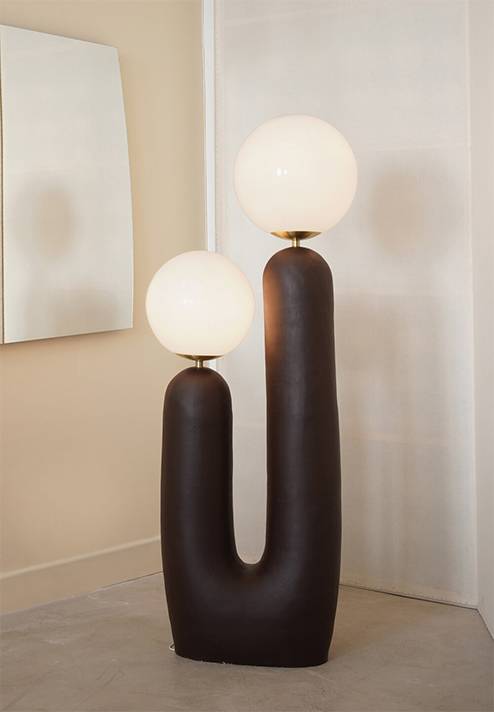
Oo Floor Lamp. This made-to-order lamp is made from a ceramic base with brushed metal options, and glass shades.
Image courtesy of: Eny Lee Parker
Parker’s pieces possess the amorphous forms of stuffed animals or maybe marshmallows. Whatever the creation, the memories it evokes are usually of a fond childhood recollection. She says that the reason she designs is to explore human needs versus human wants. The designer is fascinated with the mind and how the behavior of people leads to producing objects that mimic humanity’s ethos in character, emotions, and physicality.
Studying at Savannah College of Art and Design (SCAD), Lee Parker says that she didn’t initially find wood to be “her thing.” It was a visit to her family’s home in Korea that changed her perspective. Her aunt lives in Korea’s oldest town and together, they visited a little village that has many vintage handmade ceramics. The designer bought a teapot and fell in love with the material and the history behind the object. The rest is history!
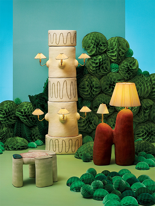
Columnar Lamp with Miniature Shades, styled by Todd Knopke
Image courtesy of: The New York Times Style Magazine, photographed by Lauren Coleman
Following her trip to Korea, Parker visited a children’s ceramics class and really fell in love with the material. She instantly realized how utterly therapeutic working with clay was. With an opportunity to do an art residency at SCAD; the artist presented ceramics as her main medium for furniture and it was accepted. The items that Parker produced garnered a lot of publicity and suddenly, she was known as a ceramics artist.
With the gallery-worthy pieces that she designs, it appears as though Parker’s potential is limitless . Somehow in her hands, clay turns into anything from totemic lamps to four-legged boucle stools. The designer tends to ignore normal “sizing standards” that typically accompany commercial lighting design. For example, rather than a large shade for her 12″ x 12″ moss-green lamp base, she topped it off with a miniature green gingham shade. She has said, (courtesy of an interview with Lizzie Feidelson for the New York Times Style Magazine), “Design has so many rules to follow. There’s something so nice about questioning utility.”
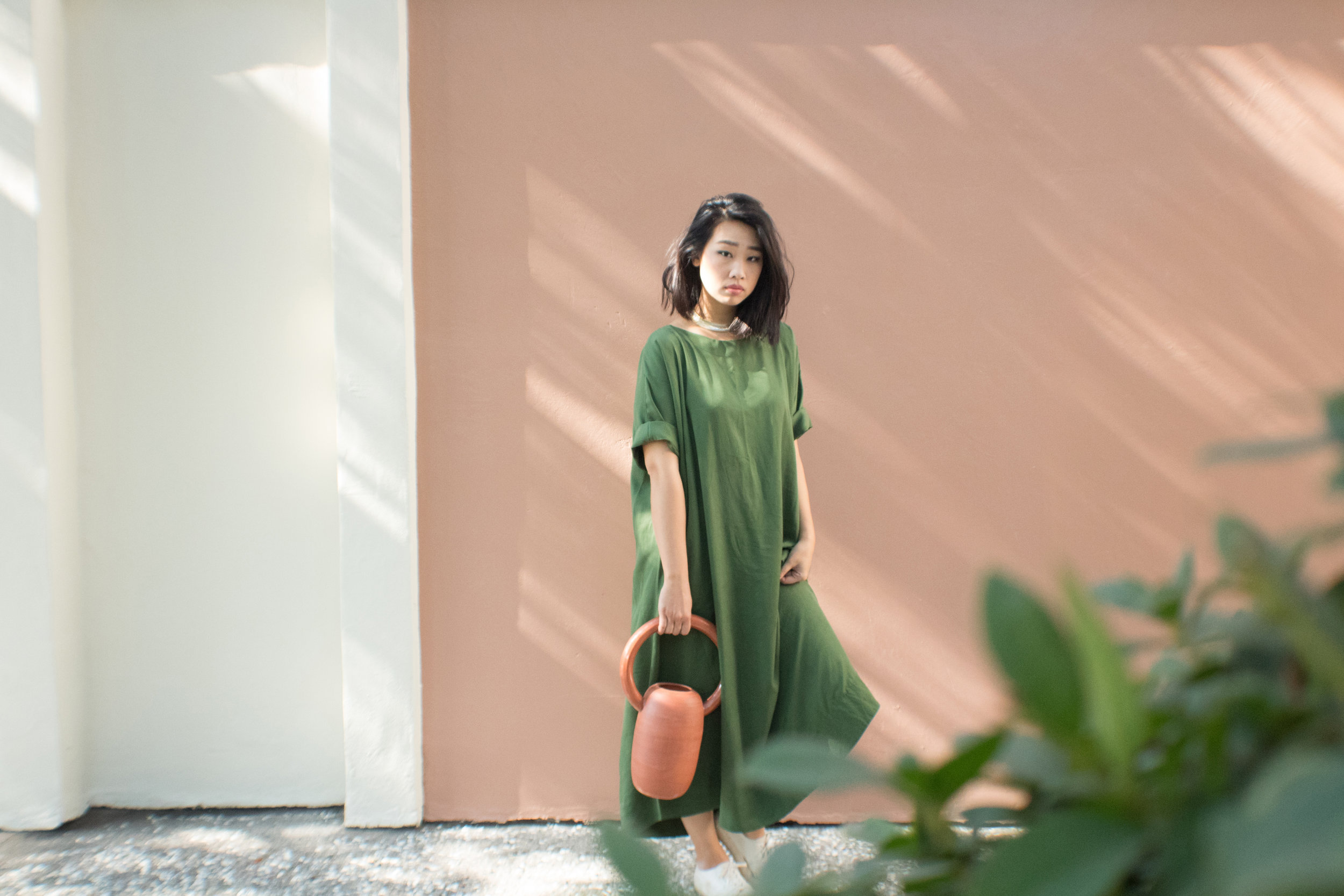
Parker’s studio is in Queens and she lives in Brooklyn; however, she spent some time Savannah during the start of quarantine.
Image courtesy of: Eny Lee Parker
Last year, Parker designed a series of eleven mirrors, stools, lamps, and side tables titled “Internal-izing.” Her inspiration this time was an individual cell… she was intrigued when she came upon a collection of vintage medical drawings at a secondhand bookstore near her home in Brooklyn. The book’s drawings contained hundreds of beautiful pen-and-ink renderings of brain cells by Santiago Ramon y Cajal, the 20th-century Spanish scientist who discovered “the noncontinuous nature of neurons, which communicate across a minuscule gap.”
Translating the drawings to clay, Parker came up with interesting shaped sconces and blood-red side tables, and lamps with “branchlike” arms that were topped off with vintage shades that Parker found at local antique shops and church garage sales. Parker’s dedication and love of “whimsical” certainly comes through in this collection.
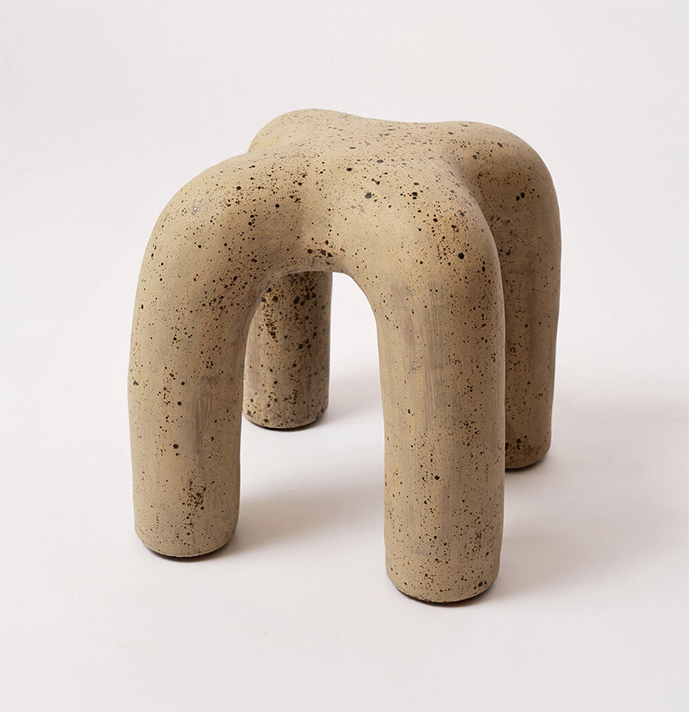
The Ceramic Stitch Stool was designed in 2019.
Dimensions are: 22″(w) x 18″(h) x 22″(d)
Image courtesy of: Eny Lee Parker
It is clear to see that Parker has an affinity for organic shapes… not only that, but she is drawn to a neutral and earthen palette. Some have said that her work feels similar to the process of building sandcastles; in other words, the forms appear naturally shaped rather than constricted to regimented forms.
Perhaps Parker can best describe her thought-process herself (courtesy of a Design Milk interview with Gregory Han), “I come from an interior design background, and usually you’re dealing with a pretty linear space. Floor meets wall, wall meets ceiling, ceiling meets wall again, and wall circles back to floor. It’s a box. I like to think I make organic and curvy pieces so our bodies can relate to something within that space.”
