Culture
Provence’s Chateau La Coste
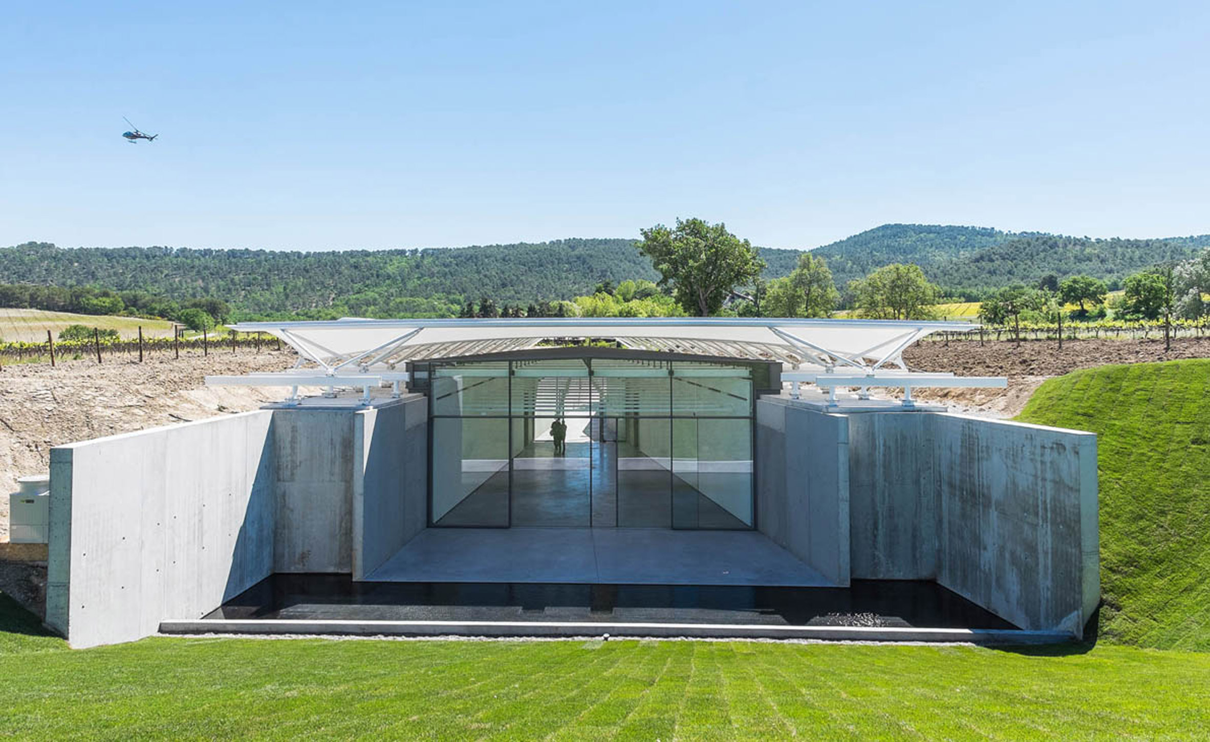
Renzo Piano’s Building Workshop is submerged almost twenty feet below ground-level.
McKillen bought the property in 2002… he wanted to transform the nondescript wine reign into a luxury destination where art, architecture, and agriculture blend together seamlessly.
Image courtesy of: Dezeen, photographed by: Stephane Aboudaram and Maurits Van der Staay.
Chateau La Coste is a wonderful hidden find in Provence. Set in a 600-acre vineyard outside a tiny town named Le Puy-Sainte-Reparade, this is the brainchild of Patrick McKillen. An Irish art collector, McKillen first dreamt up this atypical art escape in 2008.
In addition to the wonderful pieces on display, the architecture is also top-notch. Inviting Tadao Ando, Frank Gehry, Renzo Piano, and Jean Nouvel to bring their unique visions to construct structures within the protected environment; the collector says his center is dedicated to “Wine, Art & Architecture.” Let’s explore!
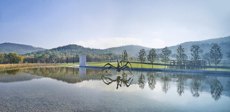
Bourgeois’ “Crouching Spider” (right) and “Boxes Full of Air” (left) by Sean Scully. You can walk inside and interact with Scully’s gigantic piece that stands 12 ft. x 20 ft. x 50 ft.
Image courtesy of: Forbes, photographed by: Richard Haughton
To start off the project, McKillen wanted to “upgrade” the vineyard’s wines to organic and to introduce a biodynamic process; this required state-of-the-art technology and a place to house the new equipment. For this task, McKillen contacted his Paris-based friend Jean Nouvel. Nouvel designed two sleek half cylinders in aluminum and stainless steel.
The most profound building however, was designed by Tadao Ando who designed the art complex. Complicating the design is that this structure was to be placed in the center of three distinct water pools. It is through Ando’s structure that guests enter the building. It was vital that Ando’s end-product encompass a facility designed around Louise Bourgeois’ 2003 “Crouching Spider.” The starchitect’s Centre d’Art is magically set amidst the lush backdrop with smooth concrete surfaces, eye-catching glass panes, and reflective pools.
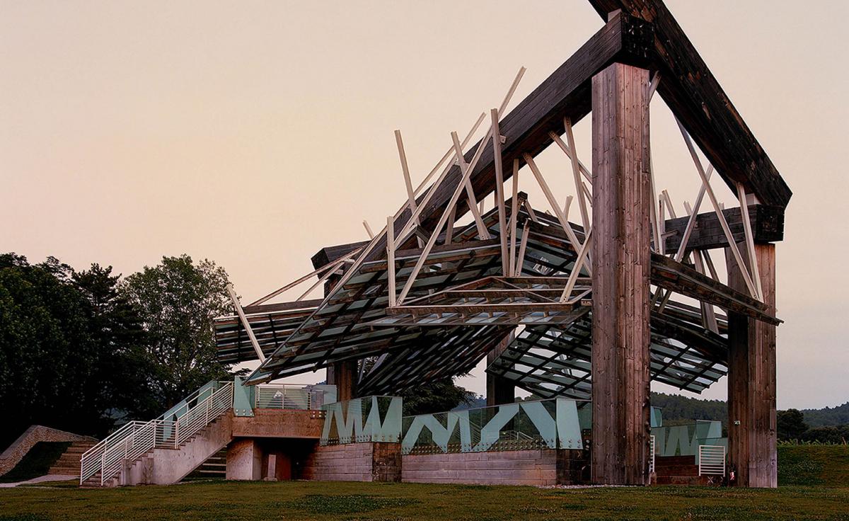
“The Music Pavilion” was made using Cor-Ten steel beams.
Image courtesy of: Wallpaper
In addition to the angular V-shaped Centre d’Art and the stunning reflecting pools, Frank Gehry’s contribution was Pavillon de la Musique (Music Pavilion). The structure is a delicate balance between steel columns, wooden beams, and glass panes. The structure was originally built in 2008 for London’s Serpentine Gallery; it looks as though it was constructed out of a rough collection of beams placed haphazardly atop one another.
Wrapping up the starchitects at Chateau La Coste, Renzo Piano was asked to design a Building Workshop. Chunky concrete walls frame the 285-square-meter building that is set six meters into the valley so that the roof is at base level with the surrounding landscape. The real concrete walls are perfect as a neutral backdrop for the exhibitions inside the 160-meter gallery space.
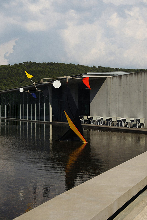
“Small Crinkly” by Alexander Calder
The piece was carefully repaired by Alexander S. Rower, the artist’s grandson. Together with Ando, Rower placed the mobile in the water; it sits opposite the Art Centre.
Image courtesy of: Dwell, photographed by: Olivia Lopez
McKillen gave the architects, sculptors, and artists free rein with their creative aspirations. The only guidance the owner gave was “Respect for the landscape.” McKillen collaborates with each artist whom he invites; the result becomes both deliberate and purposeful. Andre Fu, the Hong Kong-based architect who designed the bar, library, and 12-room space for Villa La Coste told Surface Magazine, “He works with a rare appreciation for an artist’s creativity. This is not simply a collection of boldfaced names from around the art world—it’s a genuinely thoughtful curation by McKillen himself.”
Besides Bourgeois’ stunning piece, McKillen has sculptures by Alexander Calder, Hiroshi Sugimoto, Ai Weiwei, Tony Berlant, and Richard Serra scattered throughout the picturesque landscape. Regarding placement, McKillen told Alice Cavanagh (courtesy of Wall Street Journal Magazine), “We can’t just plonk them about,” McKillen says of the placement of the commissioned pieces. The last structures on the land were built by the Romans, so I was very careful to respect every tree, every blade of grass and every herb.”
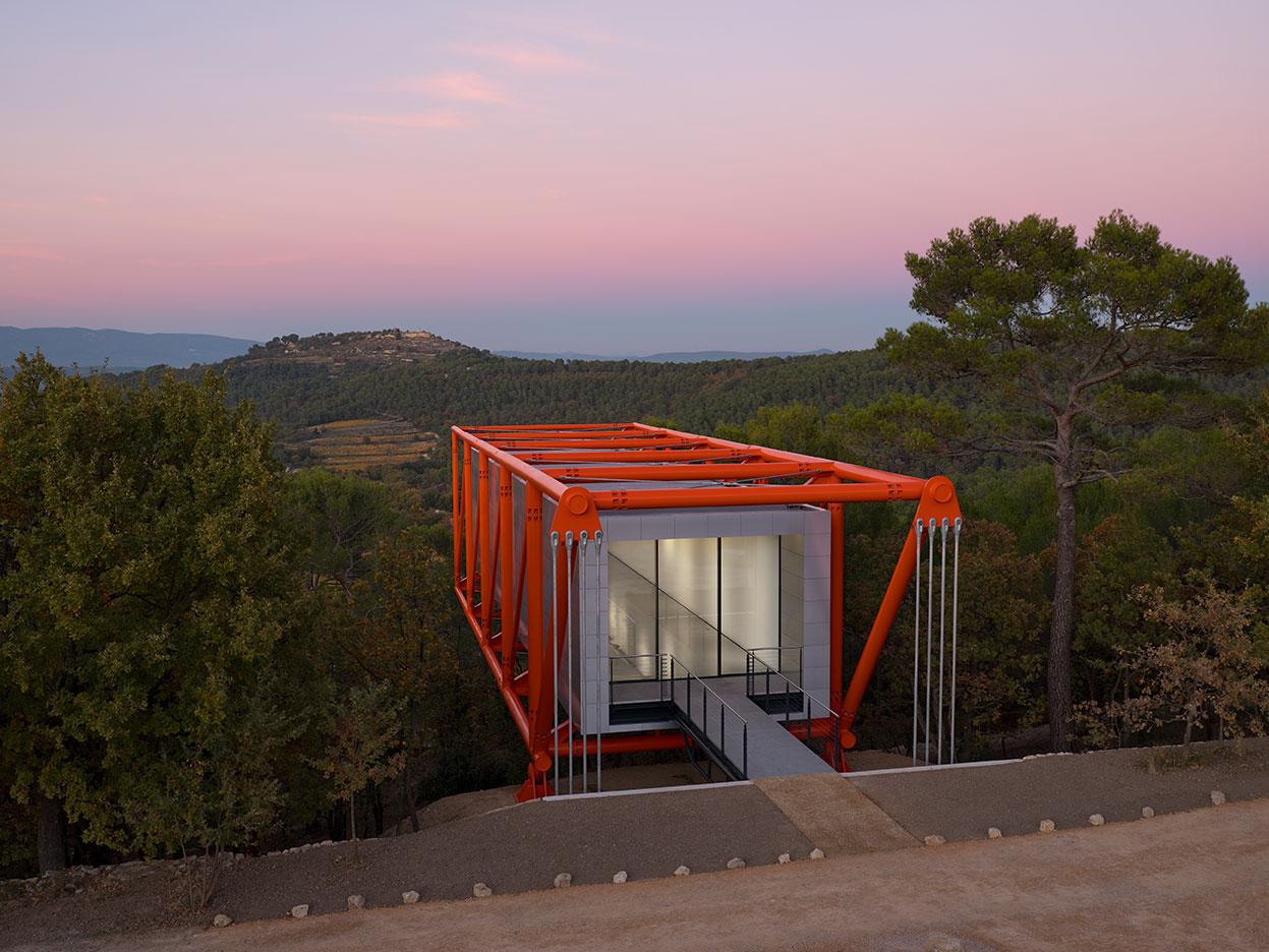
Rogers has always loved to design buildings which touch the ground as lightly as possible… and ones in bold colors. It is safe to say that he achieved both aspects with the Drawing Room project!
Image courtesy of: Wallpaper
The most recent architectural addition was Richard Rogers’ gravity-defying pavilion. Called the Drawing Room, this is the esteemed architect’s last project. The small, orange building hovers…seamlessly, effortlessly via cantilevers out of a thick and wooded ridge. It was the personal connection to Rogers that instigated constructing the additional building. The perfect design came about out of a series of conversations, mostly ones that involved eating lunch. In 2011, Rogers and his wife, Ruthie, rode bikes along the chalky track of an ancient Roman road on the property. McKillen says (courtesy of Surface Magazine), “I gave Richard two things, the idea of a gallery to show drawings, and the view.”
Rogers paid homage to Frank Lloyd Wright’s Falling water and the revolutionary use of cantilevers when coming up with the Drawing Room’s design. In his project, Wright used reinforced steel to propel two terraces into the air; Rogers however designed a cantilever from steel tubes…it works as a see-saw.
The building was prefabricated at the Bysteel Factory in Portugal and completed with the help of local architectural firm, Demaria Architecture. The first step was slicing through the heavy steel tubes at the exact right spot; then, welding the major pieces together. This was “a collision between art and science” since you have to be exact to account for the difference in size once the metal cools and shrinks. The pieces were bolted together in the factory in order to ensure that everything was fitted properly prior to being loaded onto two lorries on the way to Chateau La Coste. The finished project is one that makes Rogers proud, and it is a fitting addition to the architectural beauty at the winery. Definitely worth a visit, Chateau La Coste cannot possibly disappoint no matter where your interests lie.
