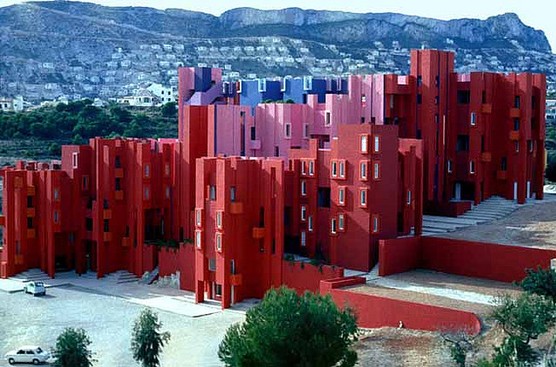
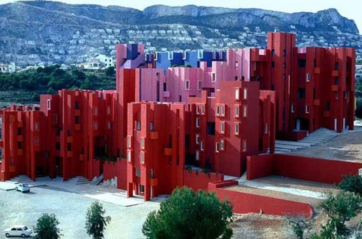
Spanish architect, Ricardo Bofill, was eons ahead of his time when designing “The Red Wall” – it resembles something straight out of a video game screen. In 1968, Bofill designed a housing project which was inspired by the Mediterranean casbah custom and the traditional architecture of the area: walled citadels, interlocking stairs and bridges (among others). Red paint of various hues cover the complex exterior facade, and the blues painted on the stairs and other surfaces compliment the reds of the fortress perfectly.
The contrast between the tones of red on the building and the bright blue of the sea is breathtaking. Stairs and circulation surfaces abound and sunlight streams in through the corners. This Post-Modernist building was built into the rocky cliffs, and looks as though it’s emerging from the earth; in fact, this complex was built using an abandoned concrete factory. Recycling the location was also ahead of its time; yet the present day result is nothing if not striking and revolutionary.

“The Red Wall” in Spain was designed around the local area’s architecture and the bright natural colors. The result is a geometric labyrinth that’s nothing short of stunning!
Image courtesy of: A Magazine

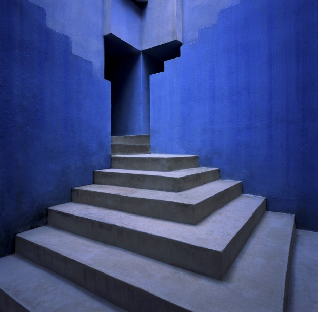
Notice the blues of the interior wall and the sunlight streaming in at it’s cornerpoint.
Image courtesy of: Arch Daily

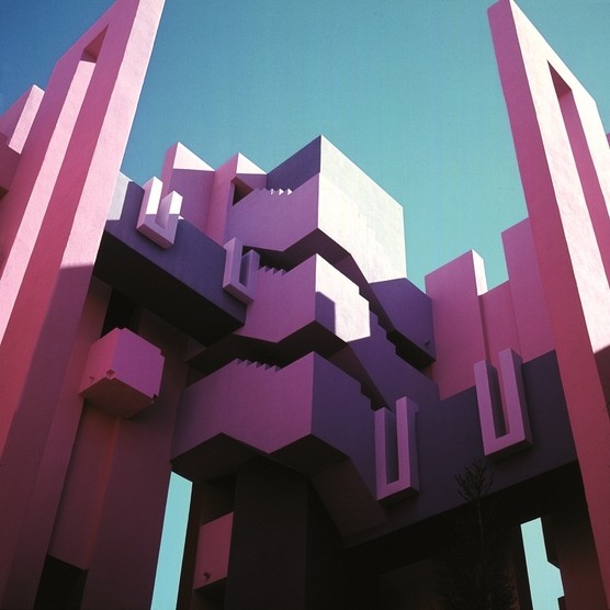
At La Muralla Roja, the 50 apartments of various sizes are linked by a series of uniform stairs, landings and bridges. The complicated geometic design gives the impression of interlocking cubes
Image courtesy of: A Magazine
