Culture
Tulum’s SFER IK
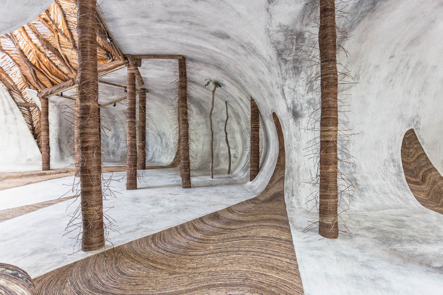
No shoes are allowed inside!
Image courtesy of: Arch Daily
In Tulum, the uber-hip, trendy, and artsy town in Mexico, an exhibition hall is quickly defying all expectations. SFER IK is an exhibition space that looks nothing like an exhibition space. It was designed as a place where artists could co-mingle and let their imagination be inspired by others and the surroundings outside.
SFER IK was created out of locally sourced wood and cement. The walls are adorned with plants that sprout along circular apertures to the world outside. This interdisciplinary place is indeed, quite magical.
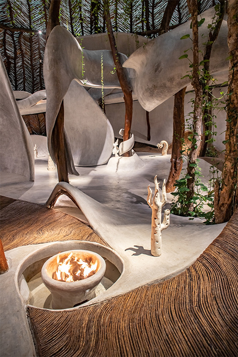
Installation view of “Alliga”.
“Alliga” was made during a three-day workshop where scientists and activists from around the world worked together to try and solve the issue of seaweed overflow in Tulum. Artists Cecilia Bengolea, Aki Inomata, and Sissel Tolaas were invited to create an exhibition of specially commissioned works to respond to the threat in creative ways.
Image courtesy of: Galerie Magazine
SFER IK is part of Azulik, an unconventional resort that is the brainchild of Eduardo Neira. Neira, or Roth as he is commonly referred to, wanted his hotel to stand out amongst Tulum’s over-saturated hospitality market. The resort is composed of wooden log bridges which connect the rooms with the spa, restaurants, meditation center, and art museum. Indeed, the whimsical design is the hotel’s most distinctive feature.
However, this design was not created without a plethora of challenges. The fact that authorization for trucks was not granted, the gradient of the road, and the idea of conservation all created obstacles for the team. Nevertheless, out of these challenges… ideas grew and evolved; and the end-product was worth all the bumps in the road.
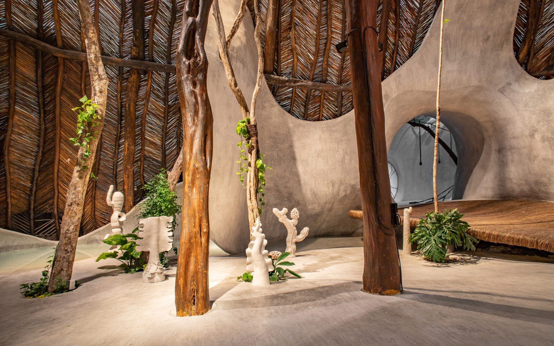
Installation of Cecilia Bengeola’s ceramic sculptures, part of “Alliga”. The installation urges viewers to think about Tulum’s future in response to the continued seaweed surplus on the Caribbean shores due to insufficient sewage systems, Amazon wildfires, global warming, and changes to the wind’s currents.
Image courtesy of: Galerie Magazine
Barefoot visitors wander across the vine-covered walkways and through the sculptural concrete spaces which are home to thousand-year-old trees. The organic design is the polar opposite of a typical white-cube, modern gallery. The warm interior hopes to elevate the senses and inspire creativity through its natural connection with nature.
SFER IK Museion’s hopes to stage exhibitions with some of the world’s finest visual artists such as Kelly Akashi, Bianca Bondi, and Rochelle Goldberg (currently exhibiting). In addition, the space will also host progressive artisanal workshops and artist-in-residence programs which will hopefully culminate in new and exciting ways of experiencing (and creating) art.
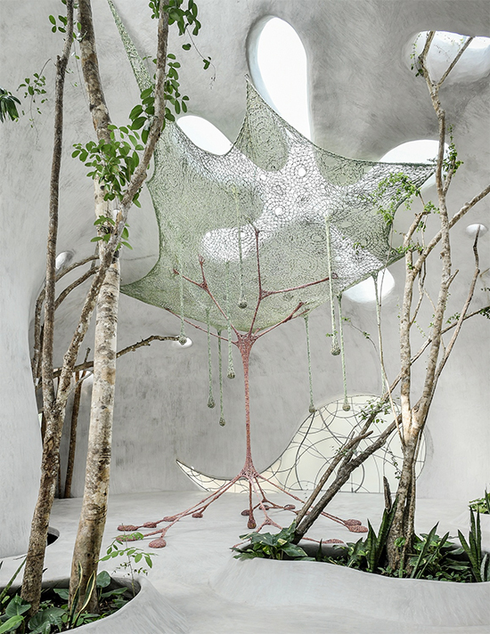
Ernest Neto’s “Every Tree is a Civilizing Entity”.
At seven-meters-high, the tree greets visitors in an intricate canopy of artfully and delicately woven cotton crochet.
Image courtesy of: Galerie Magazine
Roth worked with local craftsmen to intermix materials and natural elements which engulf visitors into the unexpected. It is like you are traveling down Alice’s Rabbit Hole… although what you encounter is surely more exciting. Some people have said that the architecture is stiff competition even for the amazing art being displayed.
Plants come out of pathways made out of logs, while the smooth, white concrete walls look like curtains flowing in the wind. The light concrete walls serve as a fabulous contrast to the woods’ darker tones. It is all intentional and meaningful… surely one would never imagine that Roth is an amateur architect and designer!
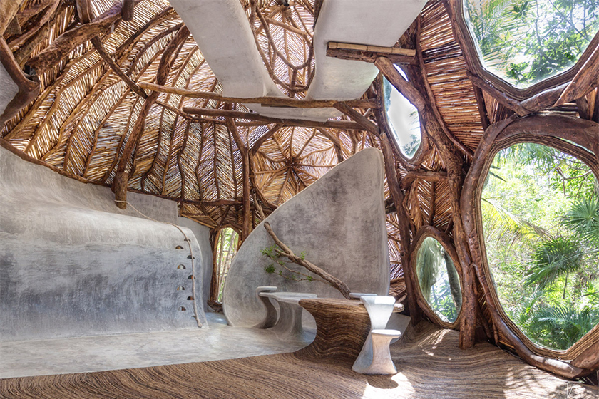
To project his vision behind SFER IK, Roth uses the ancient Greek word, “museion” which means “temple of the muses”.
Image courtesy of: SFER IK
About his space, Roth says, “When people leave art museums, they might feel frustrated, but here, nature and art complement each other to create meditation.” He also said, “It’s important to confront and open visitors’ conceptions, and the architecture inside our museums helps people gain their control.”
We couldn’t agree more!
