Architecture
Acne Studios boutique outdoes itself!
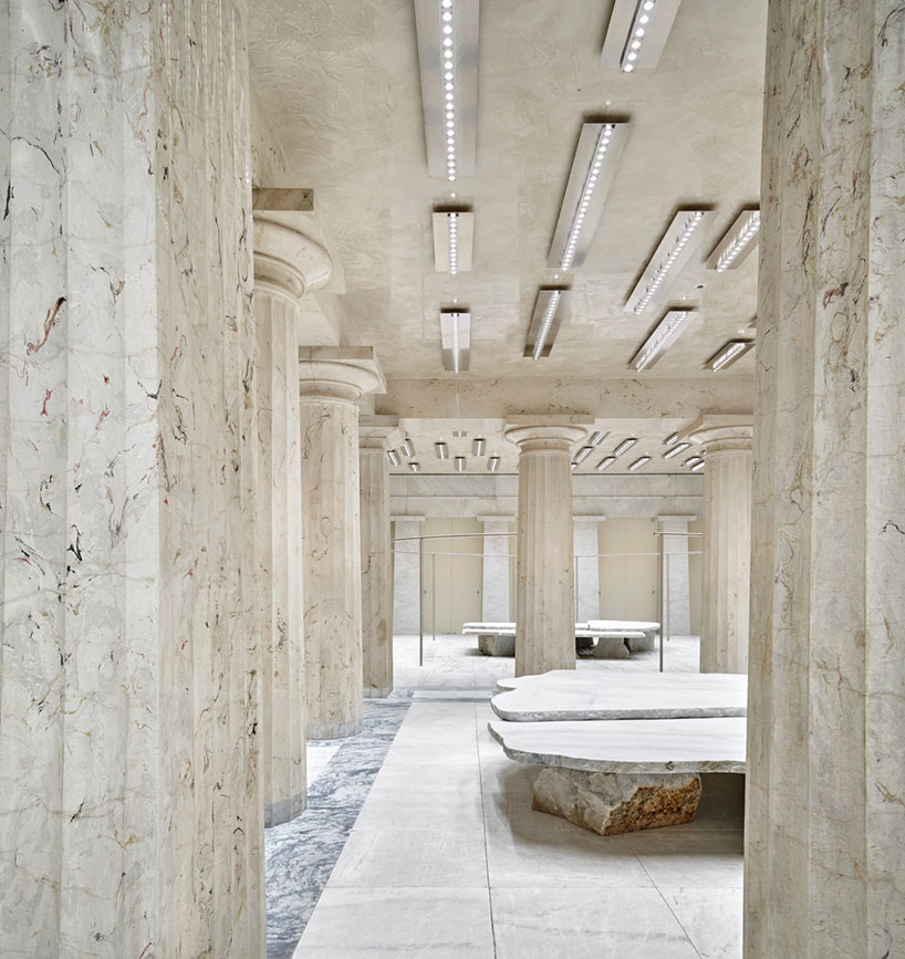
The stunning renovation was completed in October 2020.
Image courtesy of: The Cool Hunter
Last year, in the midst of the world’s craziness, Acne Studios outdid itself with when it refreshed its Norrmalmstorg store. The Stockholm boutique has a storied history; it is the location where four bank employees were held hostage in 1973. The flagship locale follows the brand’s global ethos… each location makes use of local “design language.”
Creative Director Jonny Johansson was quoted as saying, “It’s a temple. For me the idea of a temple is a place that belongs to no one but is owned by everyone. It’s part of our history but also the future. This is how I see our monumental flagship store in Stockholm.”
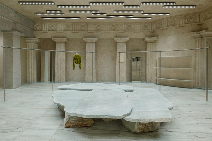
The bank’s name was Svveriges Kredit Bank. The stunning building is located in Stockholm’s city center.
Image courtesy of: WWD
The Swedish brand has called the location in this 19th-century building at Norrmalmstorg Square- home- for many years. It is an intriguing locale due to the six-day hostage abduction that took place there; and also because it is where the term “Stockholm Syndrome” was coined. Called “norrmalmstorgssyndromet” in Swedish, the psychological phenomenon refers to what happens when hostages sympathize and empathize with their captors.
With the historical significance, Acne Studios knew that it had the world’s eyes upon the dramatic renovation. The company teamed up with the Barcelona-based firm Arquitectura-G. The founders, Igor Urdampilleta and Actor Fuentes, were familiar with Acne Studios’ requirements since they were in charge of designing the Nagoya store in Japan.
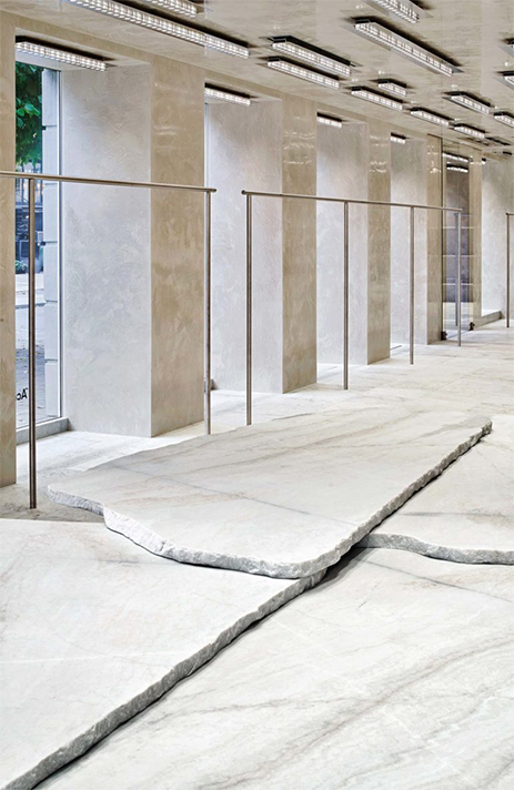
The restoration sought to return the building to it’s hallmark of a traditional early 20th-century “temple of money.”
Image courtesy of: Trendland
Previously, renovations were carried out by various past occupants; unfortunately, those uneducated refurbishments spoiled the building’s original configuration. Johansson desired to revive the structure’s original splendor of neoclassical architecture
The flagship store was restored entirely including the Ekeberg marble tile flooring which returned the building to its original material palette. About the flooring, the studio said (courtesy of Trendland), “The project cleans up the space, leaving only the essential features. Although the floors were made of real marble, many elements were faux marble, and the project plays with this duality. All the skin surfaces are monochrome within the shades of the original Ekeberg marble.”
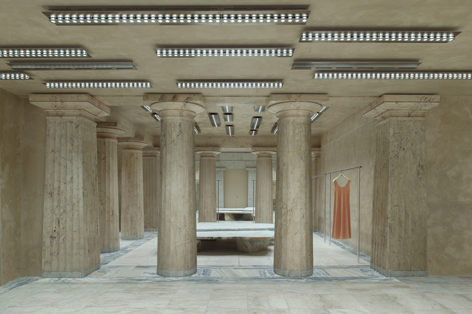
The store’s five oversized marble display tables were created by Max Lamb.
Image courtesy of: Superfuture
In addition to the floor, the enormous Doric columns were upgraded. Previously, the traditional pillars once “chained together” the old banking halls. This was redone in imitation marble in the back of the store in order to designate a new area for the fitting rooms. For lighting, a grid of metal lights were adhered to the ceiling and a selection of resin display surfaces (although with a marble-like finish) mirror the area’s grandeur. All of this was done impeccably, thanks to the research that Arquitectura-G conducted prior to starting the project.
Along with the British furniture designer Max Lamp and the French lighting designer Benoit Lalloz, the store is the product of an international team. The Swedish store is what it is thanks to Spanish architects, British-designed furniture, and French-envisioned lighting.
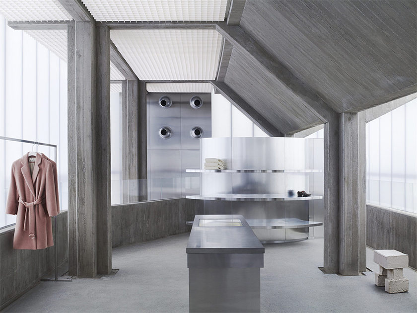
The Seoul flagship store, designed by Sophie Hicks. All the clothing is displayed on thin metal rails that stand against freestanding polycarbonate walls which contrast with the exposed board-marked concrete columns.
Image courtesy of: Dezeen
Acne Studio stores are always beautiful… albeit completely different from one another. Another one of their boutiques worth mentioning is the Seoul flagship which was designed by the London architect, Sophie Hicks. The minimalist stying consists of four concrete columns which hold up the roof and upper floor. One of the columns is surrounded by a floating concrete staircase. All the items are sparsely displayed and hung on thin metal rails. Hicks says (courtesy of Dezeen), “There is not a single decorative finish of any traditional kind and no equipment- no ducts or pipes; no entrails or vital organs; no obtrusive mechanical realities- are allowed to disturb the atmosphere within.”
