Design
Blockbuster Gio Ponti Exhibition
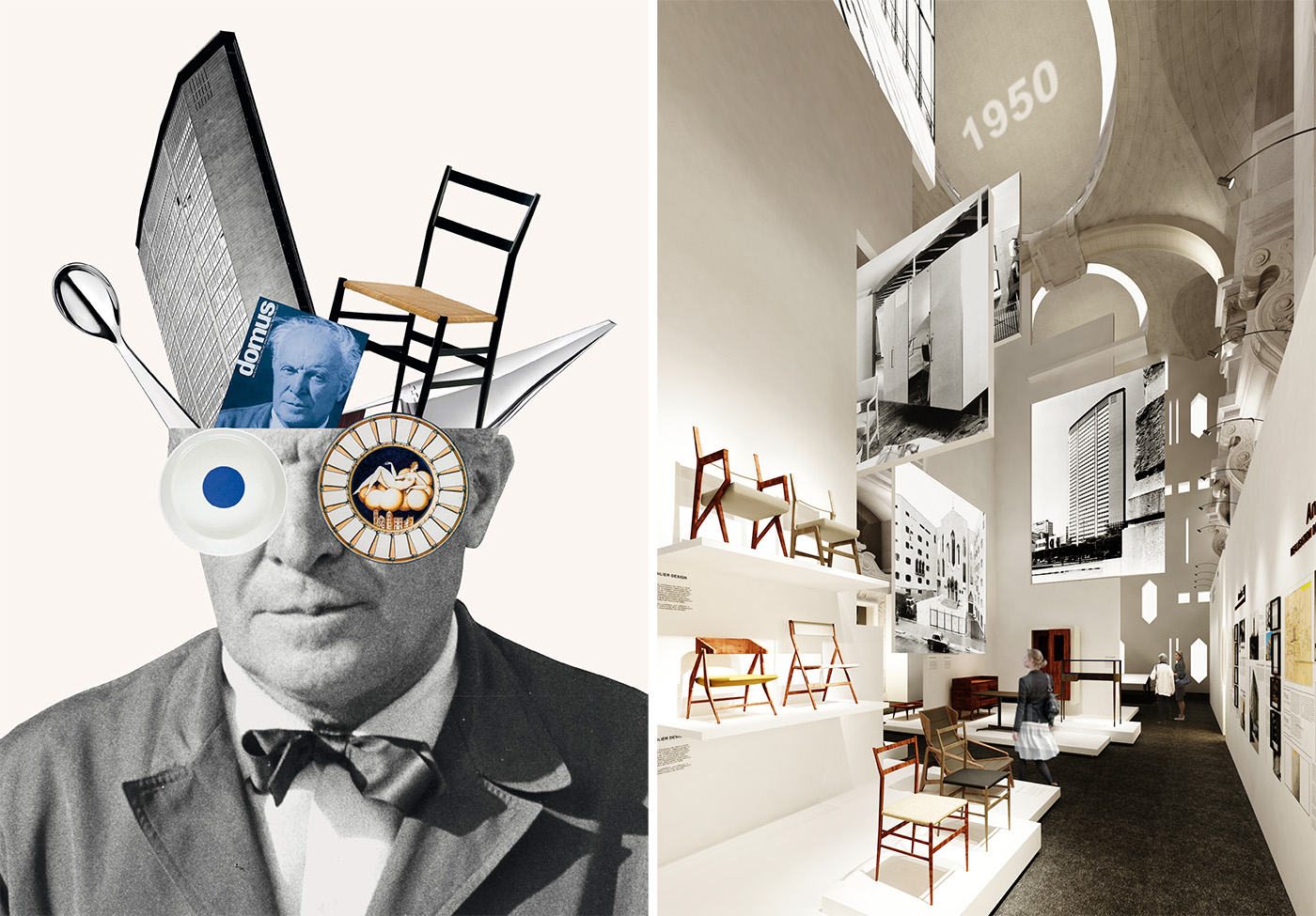
The exhibition design was conceived by the agency Wilmotte & Associés, in collaboration with the graphic designer Italo Lupi. Image courtesy of Wilmotte, scenography designed by Wilmotte & Associés.
Recently, Paris’ Musee des Arts Décoratifs put on a Gio Ponti exhibition, beautifully curated and extremely prolific in scope. Often considered the “godfather of Italian design”, this exhibition showed off the modernist master’s work in an enlightened light.
“Tutto Ponti: Gio Ponti Archi-Designer” is a wonderful representation of Ponti’s long history presented through drawings, photos, and color illustrations gathered at various locales such as private homes, universities, and cathedrals. In addition, there’s a vast amount of furniture and decorative accessories that fill the empty spaces. It’s certainly a feast for the eyes!
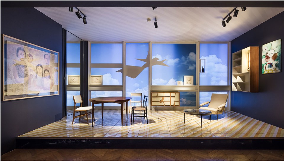
A re-creation of Ponti’s home, on the eighth floor of a building he designed in Milan. Ponti’s Via Giuseppe Dezza address, circa mid-1950’s, is a stunning replica (and an interesting family portrait). Image courtesy of: Domus, photographed by Luc Boegly.
The retrospective included over 400 pieces presented in a chronological order of Ponti’s six decade career. Throughout his career, Ponti’s multi-disciplinary approach represented architecture, design, publishing, and interior design. Spanning 1921-1978, Ponti was one of the first professionals to show interest in both industrial and craft production; and he was instrumental in revolutionizing post-war architecture.
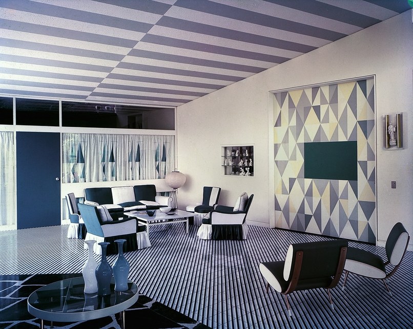
Ponti’s Hotel Parco dei Principi in Sorrento, Italy. Image courtesy of Architectural Digest
The exhibition ends with six “period rooms” that wonderfully emphasize the global reach of his work. Each individual room represents a decade: l’Ange volant in the Parisian aera, the Montecatini building in Milan, the palazzo Bo – Padua University, Gio Ponti’s home on the via Dezza in Milan, the interior of the Parco dei Principi hotel in Sorrento, and the Villa Planchart in Caracas.
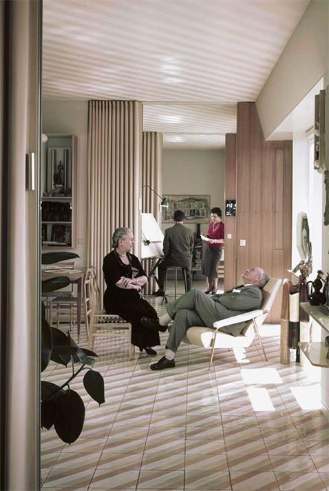
Gio and Giulia Ponti at their Milan home. Gio Ponti is relaxing in one of his Distex armchairs and Giulia sits upright in a chair resembling the Superleggera.
Ponti spent 1956-1957 designing a nine-story residential building that became Ponti’s headquarters. This building housed Ponti’s architectural office, his studio, and the Domus editorial offices. The eighth floor was where the Ponti family set up his “family headquarters”… here, they lived a “transparent” lifestyle with a lot of open space. Image courtesy of Architectural Digest
Ponti was excited about designing an “Italian house”… comfort was always meant to transcend pure functionality. He advocated for modernity and wanted everyone to be able to have access to it. Ponti was the first Italian architect to engage the public by writing articles in newspapers. He also debuted an affordable line of furniture with simple lines for Italian department stores. In addition to furniture, Ponti also designed lighting and textiles.
For Ponti, first impressions counted for so much. He said, “The facade belongs to the passersby. After all, architecture is made to be looked at.” With that perspective, Ponti went on to design stage sets and costumes for La Scala in Milan and Murano glass for Paolo Venini. Perhaps most important was how Ponti continued to promote the era’s industrialism. He was vocal in adhering that manufacturers should never lose sight of their artisan roots. Some believe that it was this theory that gave rise for the small-scale, high-quality, often family-owned Italian firms such as Artemide, Dolce & Gabbana, and Salvatore Ferragamo.
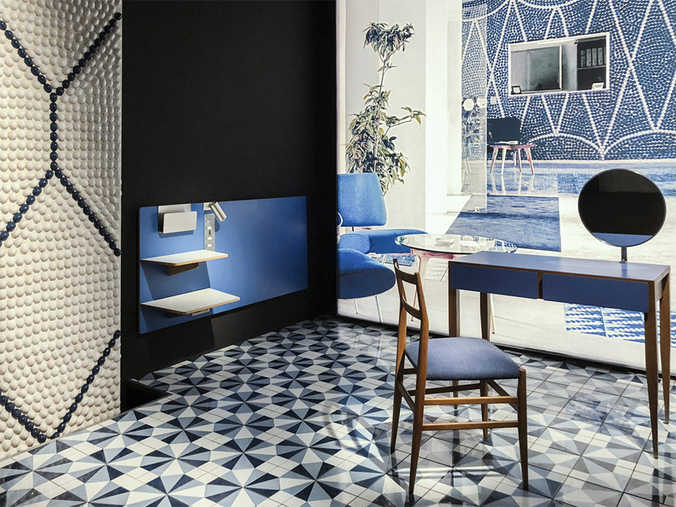
Room installation at Sorrento’s Hotel Parco dei Principi, circa 1960.
In a short film from 1961 which is also included in the exhibition, Ponti says about his proposal to build rows of skyscrapers surrounded by parks and modernist houses, “Rome has hills, Naples has islands, the sea and Vesuvius, but Milan- we got nothing.” Image courtesy of: StylePark, photographed by Fabian Peters.
Ponti’s prolific work is recognized worldwide as a symbol of modernity, integrity, and sophisticated Italian design. He shaped the era’s design aesthetics and proceeded to showcase his new and unique style to a wide audience.
One of our favorite aspects about Ponti’s style was his interplay between color and surface. In such, he worked to make walls appear floating vs. load bearing. In particular, Ponti favored ceramic wall coverings that capture and reflect light. It’s a design aspect that’s still “en vogue” today… and one we like to mimic!
