Architecture
Bottleworks Hotel
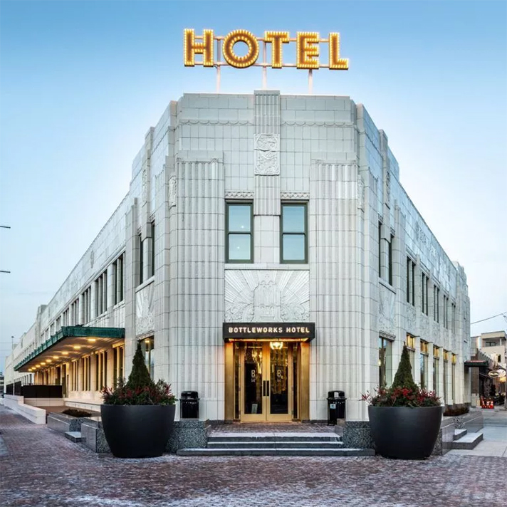
This location served as Coca-Cola’s flagship plant at the height of the company’s popularity.
Image courtesy of: Kansas City Mag
Indianapolis recently unveiled a new hotel that opened up in the trendy Mass Ave Cultural District. Aptly called the Bottleworks Hotel, the new hotel has people everywhere taking notice. Conde Nast Traveler, for example, just named Indianapolis one of the top places to visit in 2021. We believe that this opening contributed to the well-deserved acclaim.
The boutique hotel is housed on the top two floors of Indianapolis’ former Coca-Cola Bottling plant. At one time, this location was the largest in the world; sadly though, the facility was not in good condition. Now, the renovated space anchors the new Bottleworks District, a $300 million revitalization project that includes, among other attractions, a new food hall, a trendy Living Room movie theater, and a retro-styled bowling alley and arcade.
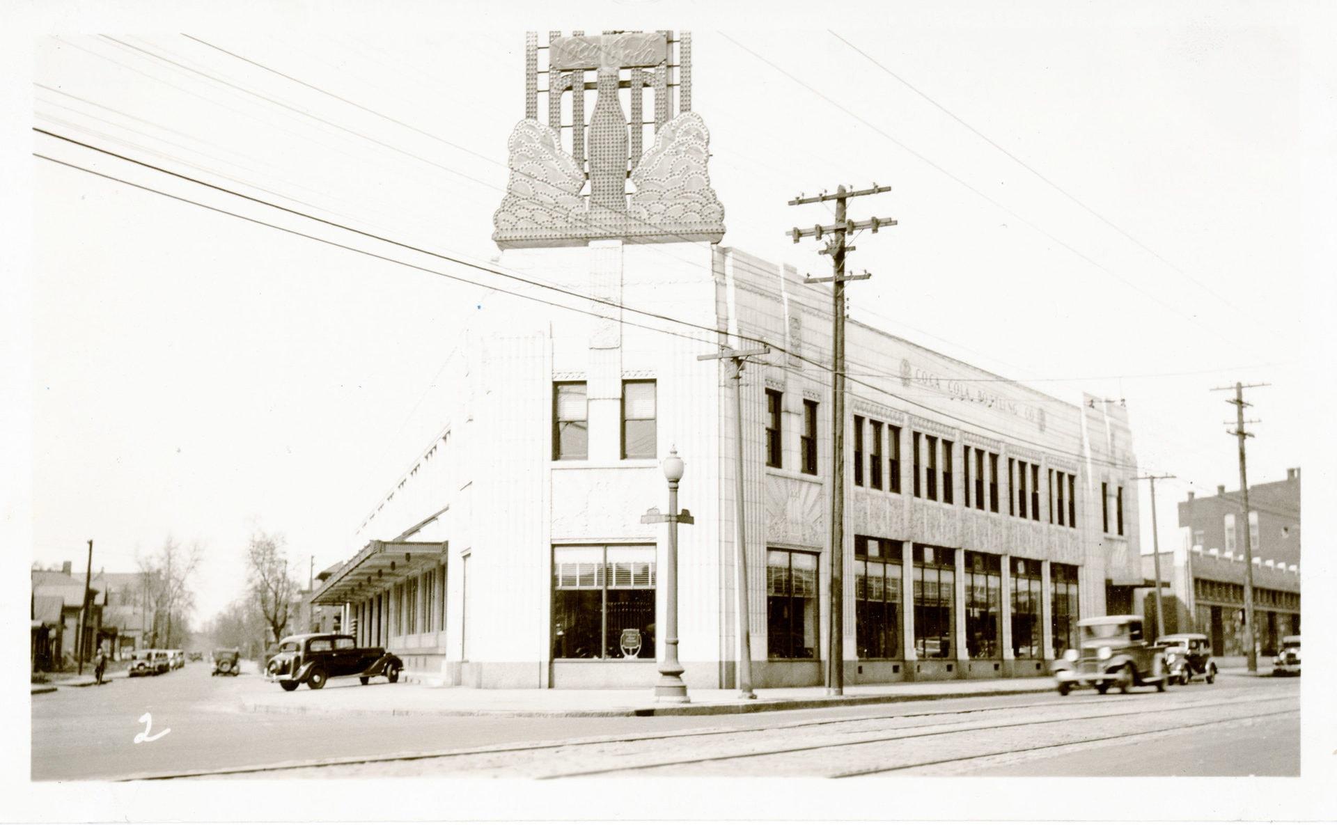
The building circa 1935.
Image courtesy of: Roadtrippers
The history behind this historic building is long and storied! In the 1920’s, Lee and James Yuncker commissioned the construction of this future plant and started bottling Coca-Cola at the facility. Rapidly, the structure’s unique architecture and state-of-the-art equipment established the building’s place in the bottling industry and beyond.
In addition to jazz music and Prohibition, the Roaring Twenties were noted for Art Deco architecture and design. These characteristics were implemented into the building’s style in elegance and sophistication. The plant stayed open through the Great Depression and during its peak, the factory produced over two million bottles of soda per week.
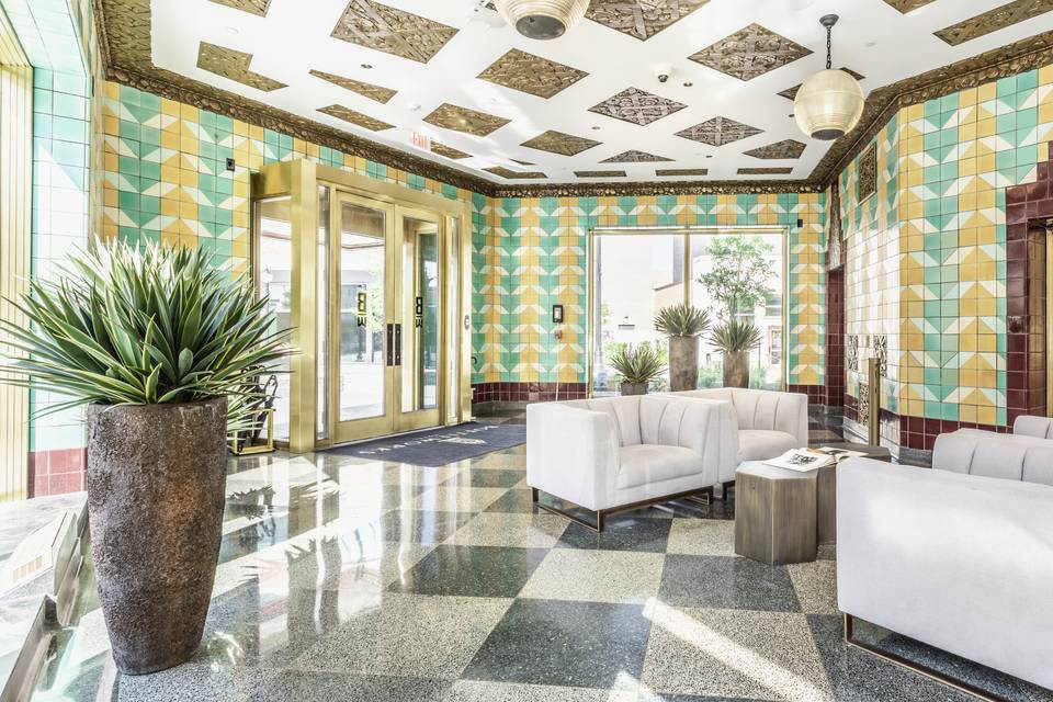
The hotel’s entrance is bright and full of light. When Zech first saw the dilapidated space, it had already been vacant and boarded- up for several years. Sadly, the plant had fallen into despair after metal cans were invented and huge bottling factories were no longer deemed necessary.
Image courtesy of: Wedding Wire
The local architectural firm of Rubush and Hunter designed the facility and it opened in 1931. Current general manager Amy Isbell-Williams (courtesy of Roadtrippers said), “The art deco was a sign of the time, and the Yunckers were willing to put in the money on the front end so that people would buy into this grandeur that they were trying to showcase.” Isbell-Williams adds that even the smallest of details are nods to the company’s signature soda.
No detail was spared and the more ornate the better. The terrazzo floors, the orate plaster ceilings, the gilded staircase, and the intricate ceramic tile mosaics were all designed without consideration for expense. The original vertical green pattern tile motif was decoded and translated to mimicking sugar cane. The red tile that goes around the doors is meant to resemble a bottle’s shape. Finally, the small mosaics in the middle look like bubbles. Barbara Zech, a local ceramic artist said that a lot of work and research went into trying to decipher the original motifs.
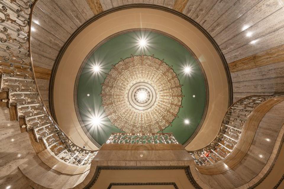
The rotunda above the spiral staircase.
Image courtesy of: Forbes
The tile process was perhaps the most labor-intensive and time-consuming of the entire renovation. Zech, a ceramicist for 25 years, spent a lot of time in historic tile preservation and was enlisted for this project. This was an enormous undertaking since the lobby alone required 800 new tiles. Zech adds that there are five different glaze colors in this space. Some finishes are matte, others are satin, and others still are glossy… all of these factors had to be considered when color-matching to each other and the original.
She says, “It was quite a process. Some of the colors in here took as many as eight layers, with base coats, underglaze, and clear coat before being fired in the kiln.” The kiln holds fifty tiles and prior to running large batches, Zech used a small “test kiln” to try out the different colors in batches of six at a time. The intensive matching and glazing job took almost eight months and when it was “installation time,” Santarossa Mosaic and Tile produced magic. Amazingly, this is the same company that installed more than 70,000-square-feet of the terrazzo products during the 1930’s and 1950’s. It was such an added benefit that Santarossa Mosaic joined the team to bring another piece of history into the end-product.
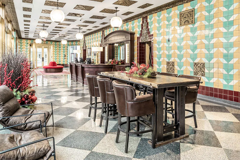
The lobby is stunning!
Image courtesy of: Hotel Planner
The love that went into preserving the history and architecture of this by-gone building shines through. The 139 rooms (all on the second and third floor), although not designed in an art deco style, fit in perfectly with the hotel’s public spaces. The individual rooms are completely outfitted in black, white, and gray with bold accents of Coca-Cola red and shining metallic hardware. Lastly, the black ceiling completes the elegant look. All the staff was personally trained by Indiana Landmarks to ensure that they can provide visitors with a complete history of Bottleworks.
Quite a lovely renovation indeed!
