Design
Frozen Motion on Porcelain
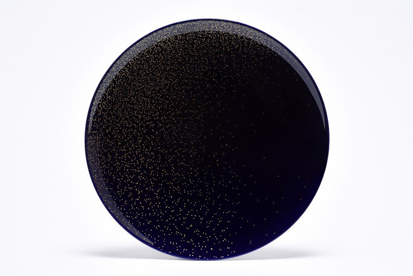
Galaxie motif in black. Image courtesy of: TL Magazine.
Philippe Apeloig has long been known in the design world as a typographer and graphic designer. For years he taught typography at ENSAD in Paris, sharing his love of letters with a younger generation. Best known for his posters, it’s here that Apeloig’s love of letter is most apparent.
Apeloig’s newest project, however, is completely absent of lettering. Here’s is the repeating and superimposing of punctuation marks that “hits the mark”.
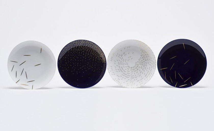
Philippe Apeloig’s plate designs from left to right: Paille, Galaxie, Tourbillon, and Paille featured in black. Image courtesy of Wallpaper Magazine.
This year Apeloig designed a porcelain series for La Manufacture de Sevres, the esteemed French ceramic house founded in 1738. Repeating and superimposing three typographic marks, single dimensional slashes appear filled with depth.
Galaxie, Tourbillion, and Straw are constellations, waves, spirals and simple scatterings in gold, white or the traditional Sevres blue. The end result is one of elegance and subtlety… striking indeed!
Tourbillion motif. Image courtesy of TL Magazine.
Tourbillion requires complete precision; the pattern is achieved through photosensitive printing. The other two pattens, Galaxie and Straw require direct engraving made all the more beautiful because of the gold coloring.
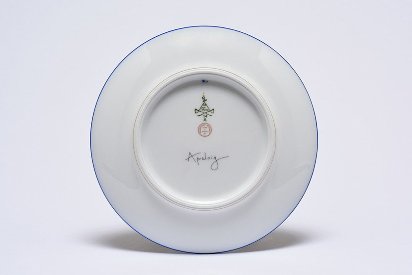
Back of Apeloig’s Diane service. Image courtesy of TL Magazine.
Especially poignant is the detailing in gold and “light in touch.” Emptiness was the emotion that they are meant to convey… even when adorned with food. And yes, you can eat off these plates, just make sure the food is as stunning as the plates it’s on.
Apeloig plays with his truest typography on the back of the plates by adding his signature, along with the Servres branding. Even here, elegant ensues!