Pedrazzini’s Le Morandine collection was showcased at the Milan Design Week earlier this year.
Image courtesy of: DesignBoom, photographed by: Katarina Di Leva
Pedrazzini’s Le Morandine collection was showcased at the Milan Design Week earlier this year.
Image courtesy of: DesignBoom, photographed by: Katarina Di Leva
Like many other artists, Sonia Pedrazzini has deep admiration for her fellow Italian, Giorgio Morandi… still-life master. Pedrazzini was so fascinated by these pieces that she worked on replicating Morandi’s compositions with her muted ceramics. The collection titled Le Morandine, features an assortment of small sculptures that can be arranged in many unique variations… allowing viewers the opportunity to move pieces around. This process mimics what an artist would do before transcribing the objects onto canvas.
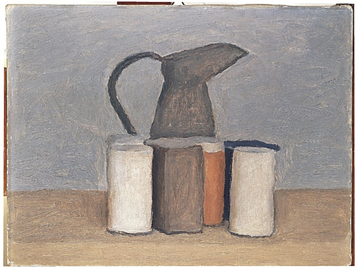
“One can travel this world and see nothing. To achieve understanding it is necessary not to see many things, but to look hard at what you do see.”

Image courtesy of: Metropolitan Museum of Art
Morandi was a painter and printmaker known for his subtly toned still-life portrayals. With his work, Morandi taught us to look at household objects through different lens. Comparing his paintings with Pedrazzini’s pieces allows us to see the inspiration clearly. It’s duly noted that there’s a lot of evidence pointing to Morandi as the master who bridged the gap between Italian art and 20th-century modernism. As such, it was natural that Morandi’s attention to detail and precision was poetic.
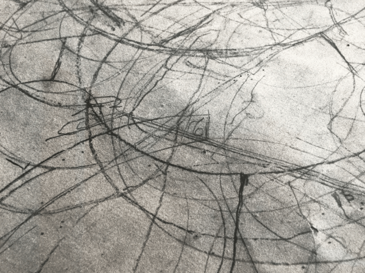
Tacita Dean, Still Life, 2009. Photographic print, private collection.
Photographer Tacit Dean was part of an exhibition at the Center for Italian Modern Art in 2009. Six of her photographic prints from Giorgio Morandi’s Bologna studio depict the mysterious marks Morandi made as he prepared to paint his still-life pieces.
Image courtesy of: Italian Modern Art
Growing up in Capri and graduating from with a degree in industrial design from a university in Rome, Pedrazzini now works with the firm, Mediterranean DNA. She’s always been keen on observing Morandi’s geometric pencil sketches which he often “doodled” on his work table to help him determine the proper placement of object. This exercise helped him select the perfect artistic composition he strived for. It’s clear that Pedrazzini took notes!
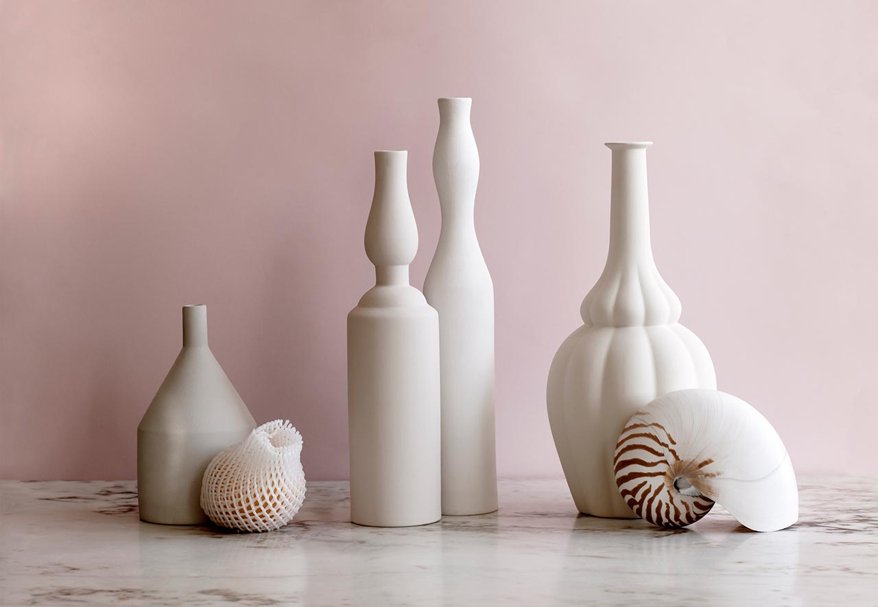
Image courtesy of: Design Best Magazine, photographed by Katarina Di Leva
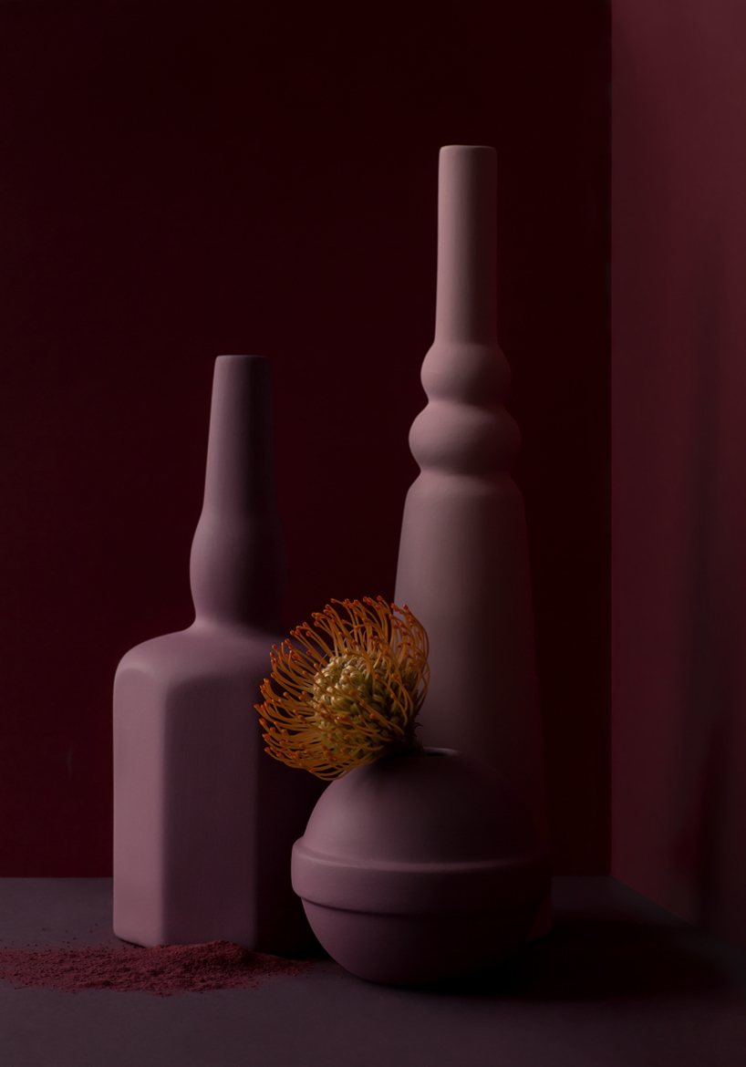
Handmade by Italian craftspeople and following Pedrazzini’s designs, the shapes of the vases flow effortlessly in space. The jars and vases are matte and chalky in appearance. Similarly, for Morandi, the subjects were simply inanimate objects “waiting” patiently in his studio. Perhaps his hope was that we stop and appreciate the small things with which we’re surrounded?
The two blue vases are themselves accessorized with a lit pipe, a glass ball, a floating seashell, and four circular, wooden coasters.
Image courtesy of: Design Boom, photographed by: Katarina Di Leva
The pieces’ sophistication is partially due to their muted colors. The pinks and blues are striking; but even the shades of white hold substantial “weight”. The Le Morandine collection beautifully reappropriates Morandi’s thesis and ensures that no one forget about the Italian master!