Design
Pierre Charpin’s diverse objects
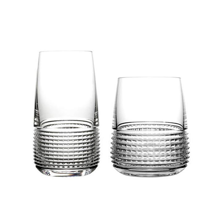
Saint-Louis Intervalle Tumbler and Highball
Image courtesy of: Scully and Scully
Perhaps it is the feeling inside his studio that provides Pierre Charpin inspiration; after all, it is the same space that was his late father’s (the sculptor Marc Chaprin). The elder Charpin worked in the same space for more than thirty years and the designer says (courtesy of an article by Becky Sunshine for Departures), “It’s a place suffused with history, even if only a few stains of paint on the floor today remind you of his presence.”
The Intervalle Collection debuted in 2011.
Image courtesy of: Daily Icon
The French designer creates projects for some of the world’s leading design houses. He is sought-after for his simple and streamlined looks. He says, “I see and understand the world in such a way that objects begin as just shapes. It’s only after that when I become interested in the function it might have.”
Specifically, the glassware that Charpin designed for the French crystal house, Saint-Louis, is a design feat. The first collaboration was the Intervalle Collection. The beautiful collection is quite contemporary; although it can easily blend in with more traditional tableware pieces The crystal style is created as vertical strips cut through the horizontal facets to create a dense pattern.
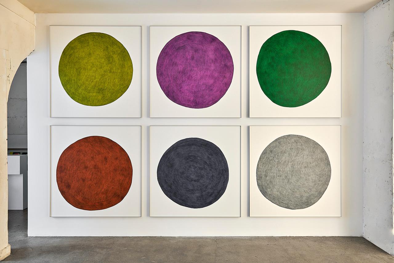
The striking piece that greets visitors entering Studio Kreo is a painting that features six large, vividly-colored circles arranged in a grid. The color was achieved thanks to India ink and colored pencils.
Image courtesy of: Wallpaper
Charpin loves to create as was evident by his show, “Similitude(s)”, the designer’s seventh solo exhibition with Galerie Kreo. Since 2000, Charpin has been a big part of the Paris gallery; his most recent show last year is a fabulous account of his artistic progression through the years.
The designer worked with a wide-ranging palette of materials that include glazed earthenware, mirror, metals, and enameled lava stone. Some new and exciting pieces, for example coffee tables, vases, lights, and drawings, were the result of this work. Interestingly, some of these pieces are ones that he has worked on for four years.
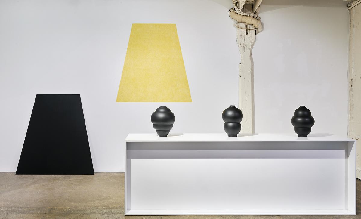
The show stands true to his philosophy that “form comes before function” in Similitudes; even though the furniture fills the space, it presents an invitation for visitors to use it.
Image courtesy of: Wallpaper
The show is filled with geometry; there is a series of five metal-framed tables with inlaid tops made from contrasting cuts of enameled lava stone. The walls are adorned with colorful mirrors made from cuts of both opaque and reflective glass… this “multiplies” the surrounding objects making for a thought-provoking display.
The series of cylindrical Lunettes vases are topped with mirrored rectangles that are punctured with two holes designed to frame flowers. Finally, the ceiling is a delicate composition of black spheres and light tubes that serve as a mobile illuminating and framing the space simultaneously.
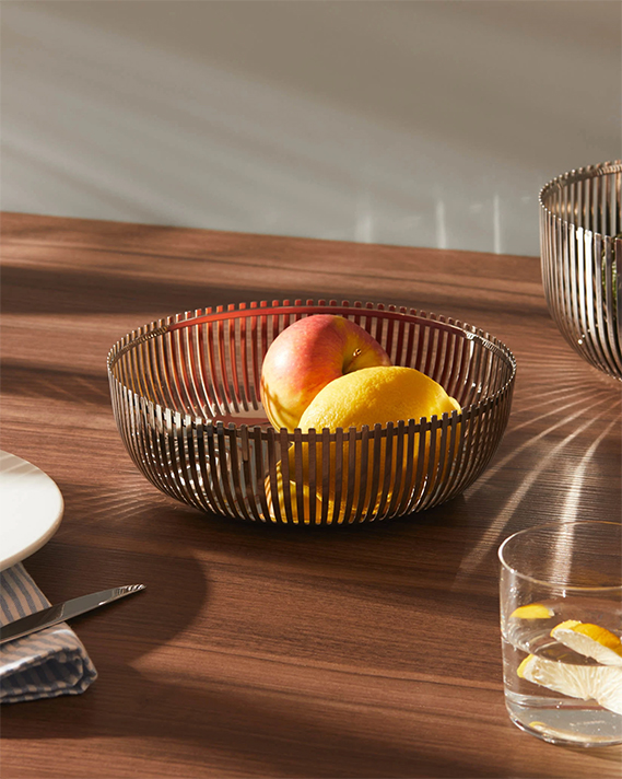
One of the baskets designed for Alessi.
Image courtesy of: Alessi
Charpin’s most well-known collaboration was with the Italian design company, Alessi. The tabletop Baskets that he created for the company reached icon status. The vase he created for Venini was nominated for Compasso d’Oro, a prestigious award. Finally on the furniture front, Charpin designed a rainbow-hued armchair named SLICE. This striking piece was sketched out in 1996 and produced by Canova in 1998… it has since been reissued.
Such a broad spectrum of work is not easy to achieve. Charpin says, “I wanted to move toward a purer, simpler look, one that invites more everyday use of objects.” We keep trying!
