LUXE – Cover Story March 2022
Second Time Around
An interior designer brings a fresh feel to a historic home she first renovated more than a decade ago.
Fifteen years ago, interior designer Suzanne Lovell refreshed a historic home in suburban Chicago for a young family of six. When those same clients recently came back to her for another update, she leaped at the chance to reimagine the landmark house. “It was a tremendous thrill to be asked to do it again,” she says.
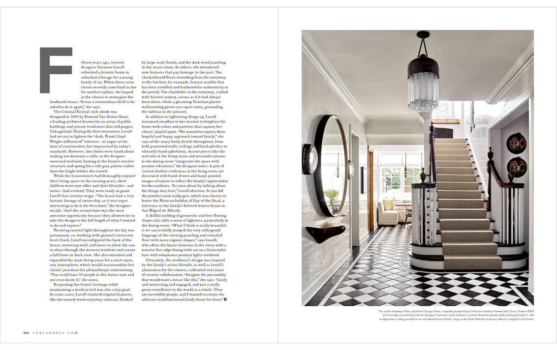
The Colonial Revival-style abode was designed by Howard Van Doren Shaw, a leading architect known for an array of public buildings and private residences that still pepper Chicagoland. During the first renovation, Lovell had set out to lighten the “dark, Frank Lloyd Wright-influenced” interiors – in vogue at the time of construction, but impractical by today’s standards. However, the clients were timid about making too dramatic a shift, so the designer exercised restraint, hewing to the home’s interior structure and opting for a soft gray palette rather than the bright whites she craved.
While the homeowners had thoroughly enjoyed their living space in the ensuing years, their children were now older and their lifestyles – and tastes – had evolved. They were ready to grant Lovell free creative reign. “The house had a very historic lineage of ownership, so it was super interesting to do it the first time,” the designer recalls. “And the second time was the most awesome opportunity because they allowed me to take the design to the full length of what I wanted to do and express.”
Ensuring natural light throughout the day was paramount, so, working with general contractor Scott Stack, Lovell reconfigured the back of the house, removing walls and doors to allow the sun to shine through the western windows and create a full front-to-back view. She also extended and expanded the main living areas for a more open, airy atmosphere, which would accommodate her clients’ penchant for philanthropic entertaining. “You could have 50 people in this house now end not even know it,” she notes.
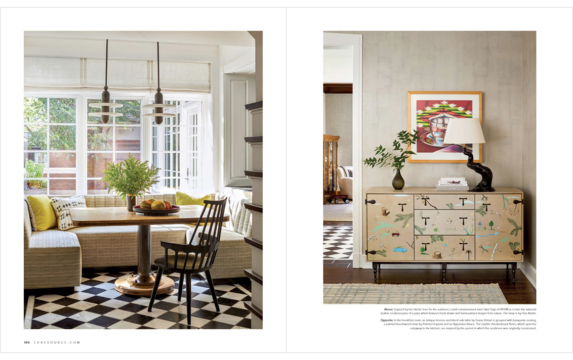
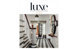
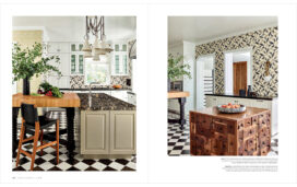
Respecting the home’s heritage while maintaining a modern feel was also a key goal. In some cases, Lovell retained original features, like the turned wood entryway staircase, flanked by large-scale finials, and the dark wood paneling in the music room. In others, she introduced new features that pay homage to the past. The checkerboard floors extending from the entryway to the kitchen, for example, feature marble that has been tumbled and leathered for authenticity to the period. The chandelier in the entryway, crafted with historic joinery, seems as if it had always been there, while a gleaming Venetian plaster wallcovering greets you upon entry, grounding the tableau in the present.
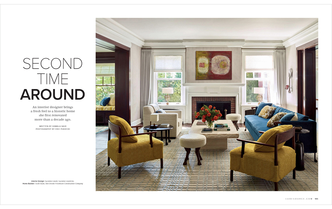
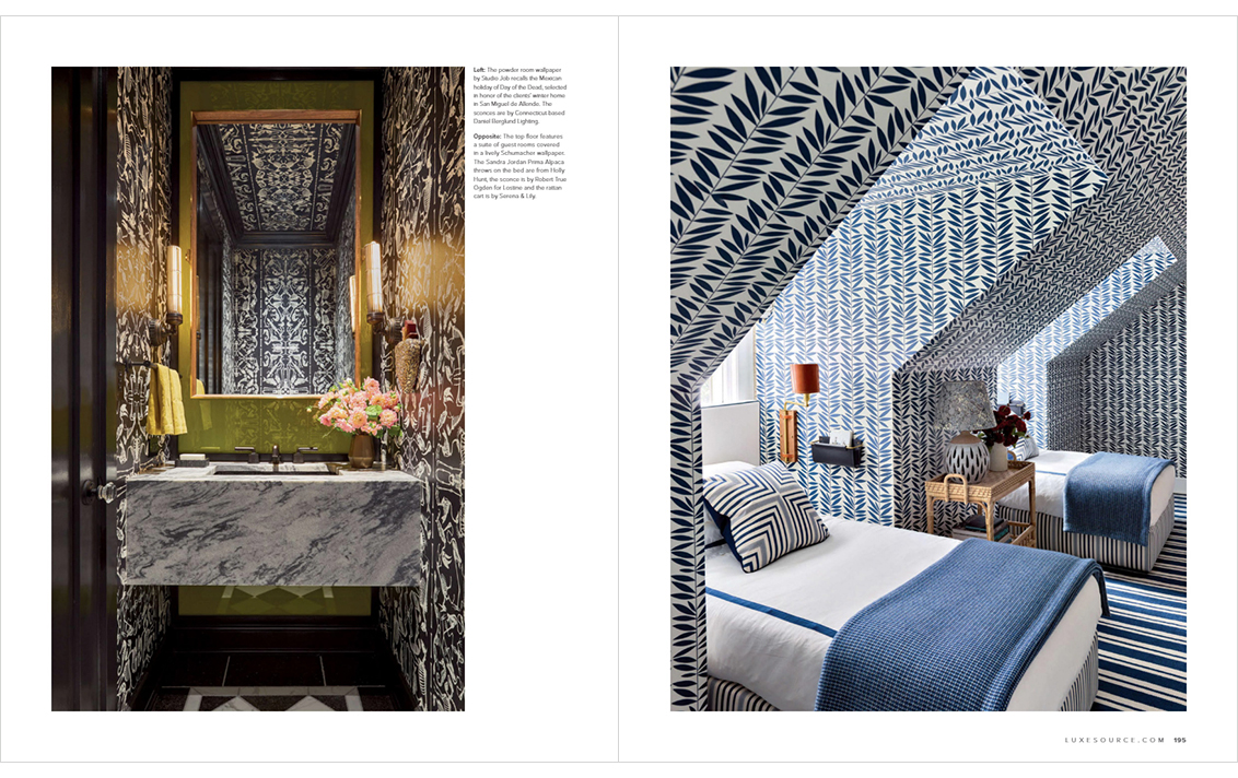
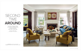
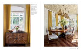
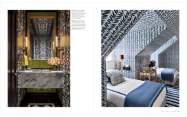
In addition to lightening things up, Lovell remained steadfast in her mission to brighten the home with colors and patterns that capture her clients’ playful spirit. “We wanted to express their hopeful and happy approach toward family,” she says of the many lively details throughout, from bold-patterned walls, ceilings and backsplashes to vibrantly hued upholstery. Accent pieces like the teal sofa in the living room and mustard curtains in the dining room “invigorate the space with positive vibrations,” the designer notes. A pair of custom leather credenzas in the living room are decorated with hand-drawn and hand-painted images of nature to reflect the family’s appreciation for the outdoors. “It came about by talking about the things they love,” Lovell observes. So too did the powder room wallpaper, which was chosen to honor the Mexican holiday of Day of the Dead, a reference to the family’s beloved winter house in San Miguel de Allende.
A skillful melding of geometric and free-flowing shapes also adds a sense of lightness, particularly in the dining room. “What l think is really beautiful is we successfully merged the very orthogonal language of the existing paneling and stenciled floor with more organic shapes,” says Lovell, who offset the linear elements in the room with a massive live-edge dining table set on a biomorphic base with voluptuous pendant lights overhead.
Ultimately, the residence’s design was inspired by the family’s active lifestyle, as well as Lovell’s admiration for the owners cultivated over years of creative collaboration. “Imagine the personality that would want a house like this,” she says. “Lively and interesting and engaged, and just a really great contributor to the world as a whole. They are incredible people, and I wanted to create the ultimate multifunctional family home for them.”
Written by Kamala Nair
Photography by Eric Piasecki with Stylist Anita Sarsidi
Interior Design: Suzanne Lovell, Suzanne Lovell Inc.
Home Builder: Scott Stack, Von Dreele-Freerksen Construction Company

