New Old House November 2020
WITH PERIOD PERFECTION
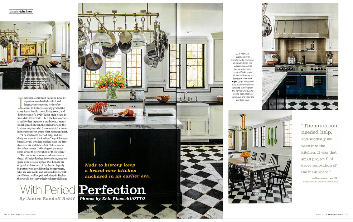
Nods to history keep a brand-new kitchen anchored in an earlier era.
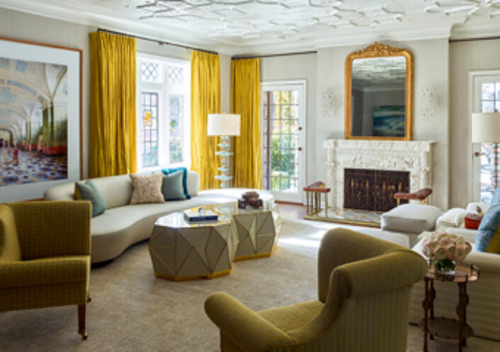
Interior Architect Suzanne Lovell’s signature touch – light-filled and happy; contemporary with references to history – already graced the entry foyer, family room, living room and dining room of a 1929 Tudor-style house in Scarsdale, New York. Then the homeowners asked for her input on a mudroom, a transitional space between the back door and the kitchen. Anyone who has remodeled a house in increments can guess what happened next.
“The mudroom needed help, and suddenly we were in the kitchen,” says Chicago-based Lovell, who had worked with the family – parents and their adult children – on five other homes. “Working on the mudroom drove the renovation of the kitchen.”
The intention was to transform an outdated, all-beige kitchen into a clean, modern space with a classic appeal that honors the original architecture of the home. Equally important was providing the homeowners, who are avid cooks and seasoned hosts, with an efficient, well-appointed, dine-in kitchen that would best serve their culinary skills and complement their sociable lifestyle.
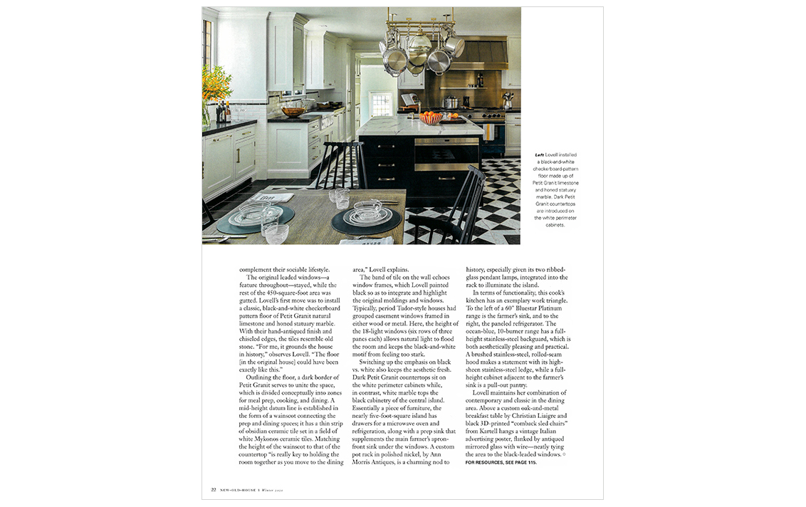
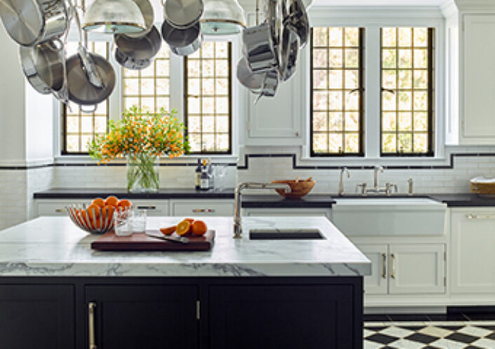
The original leaded windows – a feature throughout – stayed, while the rest of the 450-square-foot area was gutted. Lovell’s first move was to install a classic, black-and-white checkerboard pattern floor of Petit Granit natural marble. With their hand-antiqued finish and chiseled edges, the tiles resemble old stone. “For me, it grounds the house in history,” observes Lovell. “The floor [in the original house] could have been exactly like this,”
Outlining the floor, a dark border if Petit Granit serves to unite the space, which is divided conceptually into zones for meal prep, cooking, and dining. A mid-height datum line is established in the form of a wainscot connecting the prep and dining spaces; it has a thin strip of obsidian ceramic tile set in a field of white Mykonos ceramic tiles. Matching the height of the wainscot to that of the countertop “is really key to holding the room together as you move to the dining area,” Lovell explains.
The band of tile on the wall echoes window frames, which Lovell painted black so as to integrate and highlight the original moldings and windows. Typically, period Tudor-style houses had grouped casement windows framed in either wood or metal. Here, the height of the 18-light windows (six rows of three panes each) allows natural light to flood the room and keeps the black-and-white motif from feeling too stark.
Switching up the emphasis on black vs. white also keeps the aesthetic fresh. Dark Petit Granit countertops sit on the white perimeter cabinets while, in contrast, white marble tops the black cabinetry of the central island. Essentially a piece of furniture, the nearly five-foot-square island has drawers for a microwave oven and refrigeration, along with a prep sink that supplements the main farmer’s apron-front sink under the windows. A custom pot rack in polished nickel, by Ann Morris Antiques, is a charming nod to history, especially given its two ribbed-glass pendant lamps, integrated into the rack to illuminate the island.
In terms of functionality, this cook’s kitchen has an exemplary work triangle. To the left of a 60” Bluestar Platinum range is the farmer’s sink and to the right, the paneled refrigerator. The ocean-blue, 10-burner range has a full-height stainless-steel background, which is both aesthetically pleasing and practical. A brushed stainless-steel, rolled-seam hood makes a statement with its high-sheen stainless-steel ledge, while a full height cabinet adjacent to the farmer’s sink is a pull-out pantry.
Lovell maintains her combination of contemporary and classic in the dining area. Above a custom oak-and-metal breakfast table by Christian Liaigre and black 3D-printed “comback chairs” from Kartell hangs a vintage Italian advertising poster, flanked by antiqued mirrored glass with wire – neatly tying the area to the black-leaded windows.
By Janice Randall Rohlf
Photos by Eric Piasecki
