No Parallels – Vista September 2016
SUZANNE LOVELL
Founder of Suzanne Lovell Inc.
What was your favorite part about the brief?
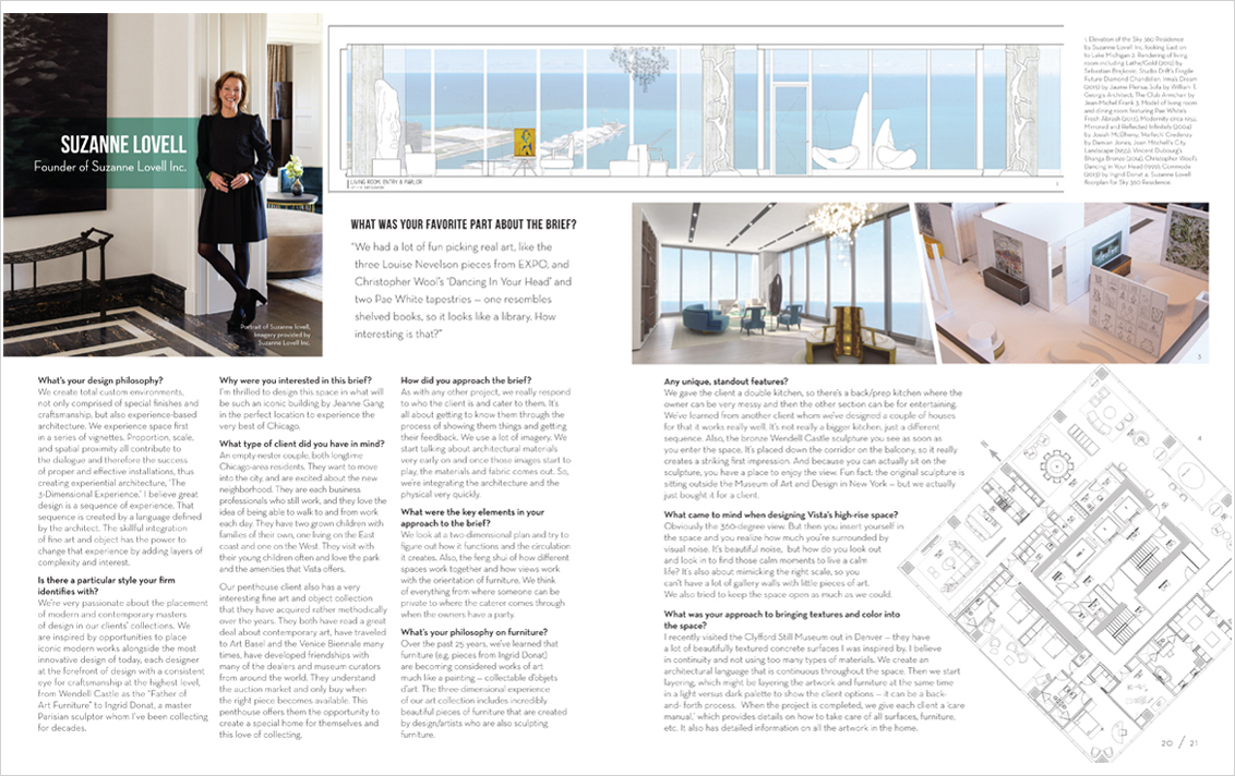
“We had a lot of fun picking real art, like the three Louise Nevelson pieces from EXPO, and Christopher Wool’s ‘Dancing In Your Head’ and two Pae White tapestries – one resembles shelved books, so it looks like a library. How interesting is that?”
What’s your design philosophy?
We create total custom environments, not only comprised of special finishes and craftsmanship, but also experience-based architecture. We experience space first in a series of vignettes. Proportion, scale, and spatial proximity all contribute to the dialogue and therefore the success of proper and effective installations, thus creating experiential architecture, ‘The 3-Dimensional Experience.’ I believe great design is a sequence of experience. That sequence is created by a language defined by the architect. The skillful integration of fine art and object has the power to change that experience by adding layers of complexity and interest.
Is there a particular style your firm identifies with?
We’re very passionate about the placement of modern and contemporary masters of design in our clients’ collections. We are inspired by opportunities to place iconic modern works alongside the most innovative design of today, each designer at the forefront of design with a consistent eye for craftsmanship at the highest level, from Wendell Castle as the “Father of Art Furniture” to Ingrid Donat, a master Parisian sculptor whom I’ve been collection for decades.
Why were you interested in this brief?
I’m thrilled to design this space in what will be such an iconic building by Jeanne Gang in the perfect location to experience the very best of Chicago.
What type of client did you have in mind?
An empty-nester couple, both longtime Chicago-area residents. They want to move into the city, and are excited about the new neighborhood. They are each business professionals who still work, and they love the idea of being able to walk to and from work each day. They have two grown children with families of their own, one living on the East coast and one on the West. They visit with their young children often and love the park and the amenities that Vista offers.
Our penthouse client also has a very interesting fine art and object collrction that they have acquired rather methodically over the years. They both have read a great deal about contemporary art, have traveled to Art Basel and the Venice Biennale many times, have developed friendships with many of the dealers and museum curators from around the world. They understand the auction market and only buy when the right piece becomes available. This penthouse offers them the opportunity to create a special home for themselves and this love of collecting.
How did you approach the brief?
As with any other project, we really respond to who the client is and cater to them. It’s all about getting to know them through the process of showing them things and getting their feedback. We use a lot of imagery. We start talking about architectural materials very early on and once those images start to play, the materials and fabric comes out. So, we’re integratin gthe architecture and the physical very quickly.
What were the key elements in your approach to the brief?
We look at a two-dimensional plan and try to figure out how it functions and the circulation it creates. Also, the feng shui of how different spaces work together and how views work with the orientation of furniture. We think of everything from where someone can be private to where the caterer comes through when the owners have a party.
What’s your philosophy on furniture?
Over the past 25 years, we’ve learned that furniture (e.g. pieces from Ingrid Donat) are becoming considered works of art much like a painting – collectable objets d’art. The 3-Dimensional Experience of our art collection includes incredibly beautiful pieces of furniture that are created by design/artists who are also sculpting furniture.
Any unique, standout features?
We gave the client a double kitchen, so there’s a back/prep kitchen where the owner can be very messy and then the other section can be for entertaining. We’ve learned from another client whom we’ve designed a couple of houses for that it works very well. It’s not really a bigger kitchen, just a different sequence. Also, the bronze Wendell Castle sculpture you see as soon as you enter the space. It’s placed down the corridor on the balcony, so it really creates a striking first impression. And because you can actually sit on the sculpture, you have a place to enjoy the view. Fun fact: the original sculpture is sitting outside the Museum of Art and Design in New York – but we actually just bought it for a client.
What came to mind when designing Vista’s high-rise space?
Obviously the 360-degree view. But then you insert yourself in the space and you realize how much you’re surrounded by visual noise. It’s beautiful noise, but how do you look out and look in to find those calm moments to live a calm life? It’s also about mimicking the right scale, so you can’t have a lot of gallery walls with little pieces of art. We also tried to keep the space open as much as we could.
What was your approach to bringing textures and color into the space?
I recently visited the Clyfford Still Museum out in Denver – they have a lot of beautifully textured concrete surfaces I was inspired by. I believe in continuity and not using too many types of materials. We create an architectural language that is continuous throughout the space. Then we start layering, which might be layering the artwork and furniture at the same time in a light versus dark palette to show the client options – it can be a back-and-forth process. When the project is completed, we give each client a ‘care manual,’ which provides details on how to take care of all surfaces, furniture, etc. It also has detailed information on all the artwork in the home.
