LUXE March 2018
Above Par
Natural textures and rich materials soften a dramatic black-and-white golf cottage making it a hole in one.
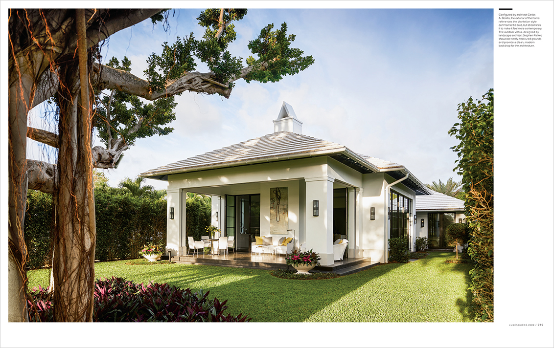
When Lost Tree Village was developed in 1961, it prided itself on being one of the most beautiful gated golf communities in the country. Today, that allure still holds true, and attracted former fashion model Shauna Montgomery and her husband, international litigation lawyer C. Barry Montgomery, to purchase a cottage there. “We knew we were buying it for the property,” recalls Shauna, adding that the house needed some updating. “It was small and chopped up into little rooms.” The dwelling was also unusually situated on the lot, virtually turning its back on a magnificent 60-year-old banyan tree about 15 feet in diameter and the lush green course beyond.
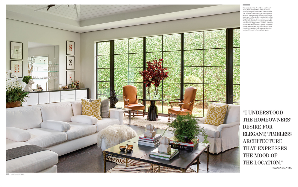
Having worked with Chicago-based interior designer Suzanne Lovell on six other projects, they turned to her for her expertise. “I understood their desire for elegant, timeless architecture that expresses the mood of the location,” says Lovell. She also incorporated the chief hallmarks of modern luxury—natural light and a feeling of spaciousness. The new structure would have to feel graciously proportioned, a neat trick for the modestly-sized home. “Let’s look at our height restriction and bring it up to the limit,” she recalls telling her clients. “Then we’re going to use very tall windows to open it to the outdoors.”
After conceptualizing the interior architecture and layout, Lovell worked with local architect Carlos A. Bonilla to design a site-appropriate structure to suit their needs. “The cottage is a contemporary reinterpretation of a Bermuda home—a modern-meets-traditional style—but in Florida,” Bonilla explains. The architect worked with Lovell on the simplified, steel-framed windows and doors, which, he adds, “had a narrow, sleek profile, with more contemporary lines than the typically thicker framed windows you usually see in this part of the country.”
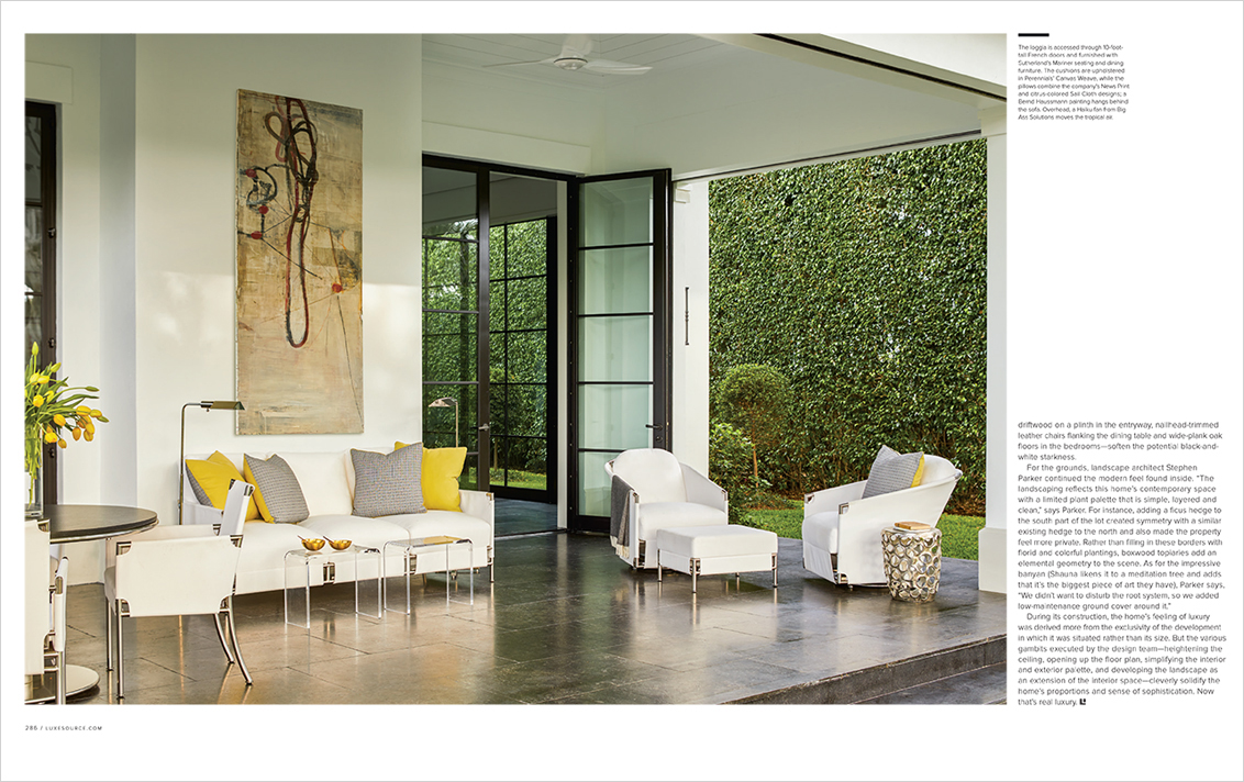
In addition to creating a new layout, the design team also reoriented the rooms. Formerly, only a kitchen, dining room and one of the bedrooms had views of the picturesque golf course, so the team proposed building a great room with a vaulted ceiling peaking at 17 feet. This space eventually leads through 10-foot steel-framed doors to a loggia overlooking the banyan tree and an 18-hole golf course. A perpendicular wall of windows looks northward onto the hedge of a tall green ficus, contributing to the sense of openness. “There had to be a transition to the outside and the landscape,” says Lovell. “Otherwise, you’d feel constrained.”
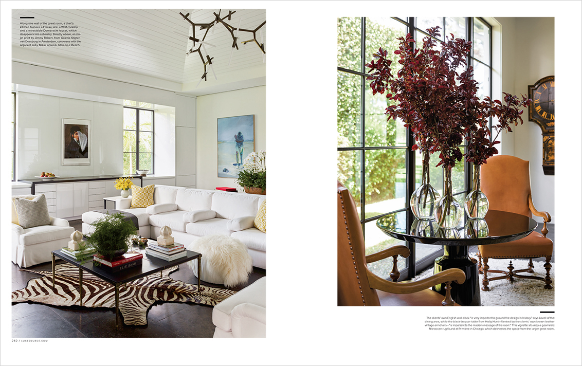
Meanwhile, builder Edward Naugle deftly concealed necessary but unsightly structural details in the great room and throughout the spaces. “The beauty of the great room,” says Naugle, “lies in the little nuances you don’t see.” It would take a keen eye, for instance, to discern the inch-and-a-half-wide air-conditioning vent encompassing the space where the walls and ceiling meet. And unless they are needed, one would never expect bug screens and hurricane shutters to roll down from narrow slotted tracks in the loggia. But the true masterpiece is a fully functional kitchen that resides virtually undetected along one wall. “In a cottage like this, every fraction of an inch counts,” says Naugle. “All appliances are housed behind cabinets, and a cutting board fits over the sink, which has a retractable faucet that lowers into the sink well.”
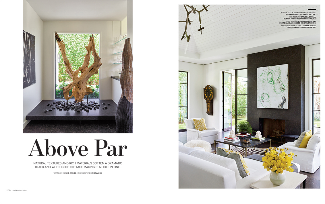
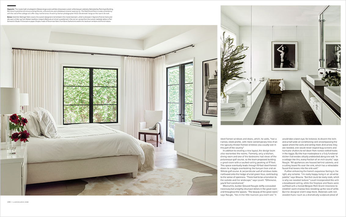
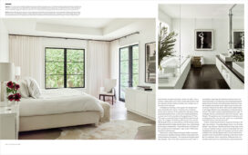
Further enhancing the home’s expansive feeling is the light, airy scheme. “I’m really happy living in an all-white palette,” says Shauna. “But that could be really stark, which is why we needed texture.” Lovell incorporated this with a beadboard ceiling, while the fireplace and floors were outfitted with a honed Belgian Petit Granit limestone to establish warm shadow lines breaking up the sea of white. But the designer didn’t stop there. Materials with rich wooden hues—such as a dramatically sculptural piece of driftwood on a plinth in the entryway, nailhead-trimmed leather chairs flanking the dining table and wide-plank oak floors in the bedrooms—soften the potential black-and-white starkness.
For the grounds, landscape architect Stephen Parker continued the modern feel found inside. “The landscaping reflects this home’s contemporary space with a limited plant palette that is simple, layered and clean,” says Parker. For instance, adding a ficus hedge to the south part of the lot created symmetry with a similar existing hedge to the north and also made the property feel more private. Rather than filling in these borders with florid and colorful plantings, boxwood topiaries add an elemental geometry to the scene. As for the impressive banyan (Shauna likens it to a meditation tree and adds that it’s the biggest piece of art they have), Parker says, “We didn’t want to disturb the root system, so we added low-maintenance ground cover around it.”
During its construction, the home’s feeling of luxury was derived more from the exclusivity of the development in which it was situated rather than its size. But the various gambits executed by the design team—heightening the ceiling, opening up the floor plan, simplifying the interior and exterior palette, and developing the landscape as an extension of the interior space—cleverly solidify the home’s proportions and sense of sophistication. Now that’s real luxury.
Written by Jorge S. Arango / Photography by Eric Piasecki
Interior Architecture & Interior Design: Suzanne Lovell Inc.
Architect of Record: Bonilla Torregroza Architecture, LLC
Builder: Hobgood Construction Inc.
